Did Apple really redesign the Apple Music logo around a “liquid glass sound” concept in 2026? It’s the kind of question that spreads fast across design forums and fan subreddits, and the honest answer is more interesting than a simple yes or no. There is a real design language called Liquid Glass. There is a real, evolving Apple Music icon. What’s much harder to confirm is a single 2026 campaign that fuses the two into one audio-reactive logo. This article separates what Apple has actually shipped from what the rumor mill has stitched together, and it explains why the confusion makes sense.
Where the “Liquid Glass” Idea Actually Comes From
Liquid Glass is not a marketing phrase invented by fans. Apple introduced it as a design language at its Worldwide Developers Conference in June 2025, tied to the 2025 operating system releases, including iOS 26 and macOS 26. The concept is a translucent, refractive material that bends light and shifts with motion, giving interface elements a sense of depth and fluidity. Buttons, toolbars, and controls pick up a glassy, light-catching quality that responds to what’s behind them.
That timing matters. Once Apple built a translucent, motion-reactive material into its platforms, it was almost inevitable that people would start imagining what a “liquid” Apple Music logo could look like. Music is the most natural fit for a design language built on flow and light. So the phrase “sound liquid glass” probably grew out of that overlap: a glassy Apple aesthetic plus the audio-first identity of the Music app.
It’s worth being clear about what can and can’t be verified. There is no confirmed, dated Apple announcement of an Apple Music logo explicitly designed as “sound liquid glass” in 2026. Anyone presenting that as settled fact is ahead of the evidence.
The Real History of the Apple Music Icon
The Apple Music logo has gone through a few recognizable phases, and knowing them helps you spot a fake leak instantly.
| Era | Icon style | What changed |
|---|---|---|
| 2015 launch | White musical note on a colorful gradient | The original Beats-influenced look |
| 2017 redesign | Solid white note on a pink-to-red gradient | Cleaner, flatter, more confident |
| 2020–2021 refresh | White note on a deeper red gradient | Simplified, bolder, more “Apple” |
Notice the pattern: each change kept the same core idea, a musical note on a gradient, and refined the color and depth. Apple rarely throws out a recognizable mark. It polishes it. That’s the single most useful rule for judging any “new logo” claim you see online. If a supposed leak abandons the note or the gradient entirely, treat it with suspicion.
Why a “Sound Liquid Glass” Logo Would Make Sense
Even without confirmation, the concept is logical, and that’s exactly why it spreads. A few reasons a liquid-glass Music icon feels plausible:
- Consistency across the system. If the whole operating system uses translucent, refractive materials, a flat legacy app icon starts to look out of place.
- Music as motion. Sound is vibration and flow. A material that ripples and refracts light is a natural metaphor for audio.
- The icon is a brand billboard. App icons are some of the most-seen design assets Apple owns, so they’re prime candidates for showing off a new material.
The catch is that Apple tends to roll out design changes gradually and quietly. A dramatic, audio-reactive logo tied to a single 2026 moment would be unusual for the company. More likely, any real update would arrive as part of a broader system refresh, not a standalone splash.
How to Tell a Real Apple Music Logo Update From a Rumor
This is where practical experience saves you time. Most “new Apple Music logo” stories that go viral are one of four things: a fan concept, an AI-generated mockup, a misread beta screenshot, or a genuine but minor tweak blown out of proportion. Here’s a checklist that actually works.
- Check the source. If the first place you saw it is a concept artist’s portfolio or an aggregator, it’s almost certainly not official. Real changes surface on Apple’s own newsroom or in a developer beta.
- Look for a beta build. Genuine icon changes usually appear inside a developer or public beta of an operating system before launch. A leak with no build number behind it is a red flag.
- Compare against the pattern. Does the “new” icon keep the note and gradient? If it reinvents everything, it’s probably fan art.
- Watch the timing. Apple announces design changes at events or in press releases, not through mysterious forum posts.
- Distrust perfect renders. Crisp, dramatic, glowing mockups are usually made in a design tool, not pulled from a shipping OS.
The most common mistake people make is sharing a beautiful concept render as breaking news. It looks convincing because it’s designed to. Slow down, find the beta, and confirm before you believe.
The Wider 2026 Apple Design Story
The “liquid glass” conversation doesn’t happen in a vacuum. Apple’s 2026 news cycle has been crowded with stories that shape how people read every design rumor. Pricing and platform policy debates, cloud infrastructure questions, and product comparisons all compete for attention, and design leaks often ride alongside them.
For instance, debates over app store economics and fee structures have kept developers and users talking about how Apple’s platform works under the hood, a theme explored in coverage of the Apple SCOTUS 27 percent app store fee case and in analysis of Apple EU app store fees for game developers. Separately, questions about where Apple’s AI features actually run have driven interest in reports on Apple Private Cloud Compute and Google Cloud. None of these are logo stories, but they show how quickly a single Apple topic becomes a cluster of rumors, and why verifying each claim matters. (Apple Music)
The design language itself is documented publicly. Apple’s developer resources describe Liquid Glass as a material that reflects and refracts its surroundings, and you can read the broader context on Apple’s Wikipedia page and in Apple’s official newsroom. Those are the places to check before trusting a screenshot.
Apple Music vs. Spotify: Why Branding Matters So Much
Logo speculation around Apple Music is intense partly because the service competes head-to-head with Spotify, and visual identity is part of that fight. Both apps live on the same home screens, and both use color and iconography to signal what they are at a glance. A meaningful icon refresh is a branding move as much as a design one.
The comparison runs deeper than logos. The two services differ in discovery, playlists, audio quality, and how they present themselves to listeners. A detailed breakdown of those differences appears in this Apple Music vs Spotify comparison, which is useful context for anyone wondering why a logo change would even matter. The short version: in a market this close, every visual cue is part of the pitch.
Where “Sound” and AI Fit In
The word “sound” in “sound liquid glass” may also be pulling in a different 2026 trend: AI-generated music. The tools have gotten genuinely good, and they’ve changed how people think about what “music” even is. If you’re curious about that space, this guide to the best AI music generators in 2026 covers the current landscape.
It’s easy to see how these threads get tangled. A reader sees a glassy, animated music icon, reads about AI music tools, and concludes Apple is doing something audio-reactive and AI-driven. But those are separate stories that happen to share a keyword. Keeping them apart is the difference between informed and misled.
Practical Tips If You’re Following This Story
If you genuinely want to track whether Apple ships a liquid-glass Music icon, here’s what works in practice.
- Follow the betas, not the blogs. Developer and public beta releases are where icon changes actually show up first.
- Screenshot the version. When you see a claim, note the OS build number. If there isn’t one, wait.
- Set up a newsroom alert. Apple’s own announcements are the ground truth.
- Ignore “leaked” renders with no source. They’re entertainment, not information.
- Give it a release cycle. Design changes usually land with a major OS update, so watch those windows.
The biggest mistake is treating a striking image as proof. In practice, the most reliable signal is boring: an official build, a version number, and a press release.
What to Expect Next
Based on how Apple has handled design transitions before, a few outcomes are more likely than a sudden standalone “sound liquid glass” logo debut.
First, any real change will probably arrive quietly as part of a system-wide refresh, not as a headline event. Second, it will likely preserve the note-and-gradient DNA rather than replace it. Third, expect the concept art to keep coming, because the liquid-glass aesthetic is genuinely fun to riff on. The gap between what fans design and what Apple ships is where most confusion lives.
If you want to stay oriented in the broader Apple ecosystem while you wait, it helps to keep an eye on adjacent product stories too, like the top AI glasses picks for 2026 and seasonal buying guides such as these Black Friday car deals. They’re unrelated to the logo question, but they show the same lesson: verify before you share.
Conclusion
Is there a real Apple Music logo “made by sound liquid glass” in 2026? The design language is real, and the icon has a real history of careful refinement. Treat the specific “sound liquid glass” logo as an unconfirmed concept, not a shipped fact. You can enjoy the creativity in the mockups while keeping your trust in betas and official announcements. Apple’s actual design philosophy, polish over reinvention, is the most reliable guide you have. A genuine change will appear in a build you can install, not only in a render you can admire.
FAQ
Did Apple release a new Apple Music logo in 2026?
There is no confirmed, official announcement of a new Apple Music logo specifically designed as “sound liquid glass” in 2026. The Liquid Glass design language is real and was introduced in 2025, but a dedicated audio-themed logo launch has not been verified.
What is Apple’s Liquid Glass design language?
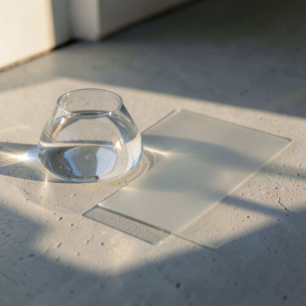
It’s a translucent, refractive interface material Apple introduced at its June 2025 developer conference for its 2025 operating systems. It bends light and responds to motion, giving controls and toolbars a glassy, fluid look.
How can I tell if a “new logo” leak is real?
Check for a beta build number and an official Apple source. Real icon changes usually appear in developer or public betas first. Fan concepts and AI mockups look polished but have no build behind them.
Does the Apple Music logo keep the same design across updates?
Historically, yes. The icon has stayed anchored to a musical note on a gradient, with refinements to color and depth rather than full reinventions. That pattern is the best clue for spotting fakes.
Why do people connect “sound” with the liquid glass logo idea?
Because music is about flow and vibration, and a material that ripples and refracts light is a natural visual metaphor for audio. The concept is appealing, which is exactly why it spreads faster than it can be verified.
Where should I look for official Apple design news?
Apple’s own newsroom and developer resources are the ground truth. Design changes are announced there or appear in beta releases, not through anonymous forum posts or concept portfolios.