
What makes a simple cloth sack instantly readable as a money bag, even when it is just a few pencil lines on paper? The answer is not the sack itself. It is the combination of a cinched neck, a bulging bottom, and a symbol that tells the brain “wealth” before the eyes have finished looking. That combination is why the money bag drawing is one of the most copied, most recognizable doodles in the world, and why so many versions of it get the details slightly wrong.
This guide walks through the shape, the history behind the symbol, and the practical steps that separate a convincing money bag from a flat blob. It also covers the mistakes that trip up beginners and the small choices that make a drawing look intentional.
Why the Money Bag Is Such a Popular Drawing Subject
The money bag works as a drawing subject for the same reason it works as an icon: it is built from a handful of simple shapes. A rounded sack, a pinched neck, a tied cord, and a currency mark. Anyone can sketch it in under a minute, which makes it a favorite for logos, classroom doodles, game icons, and quick illustrations of savings or profit. (Gift card scam works victims rarely get their money back)
There is also a practical appeal. The money bag is forgiving. Unlike a face or a hand, it has no strict anatomy to get wrong. A slightly lopsided sack still reads as a sack. That low failure rate makes it a good confidence builder for people learning to draw.
But “easy to draw” and “easy to draw well” are different things. The gap between a beginner’s money bag and a polished one comes down to weight, contrast, and a few structural decisions covered below.
A Short History of the Money Bag Symbol
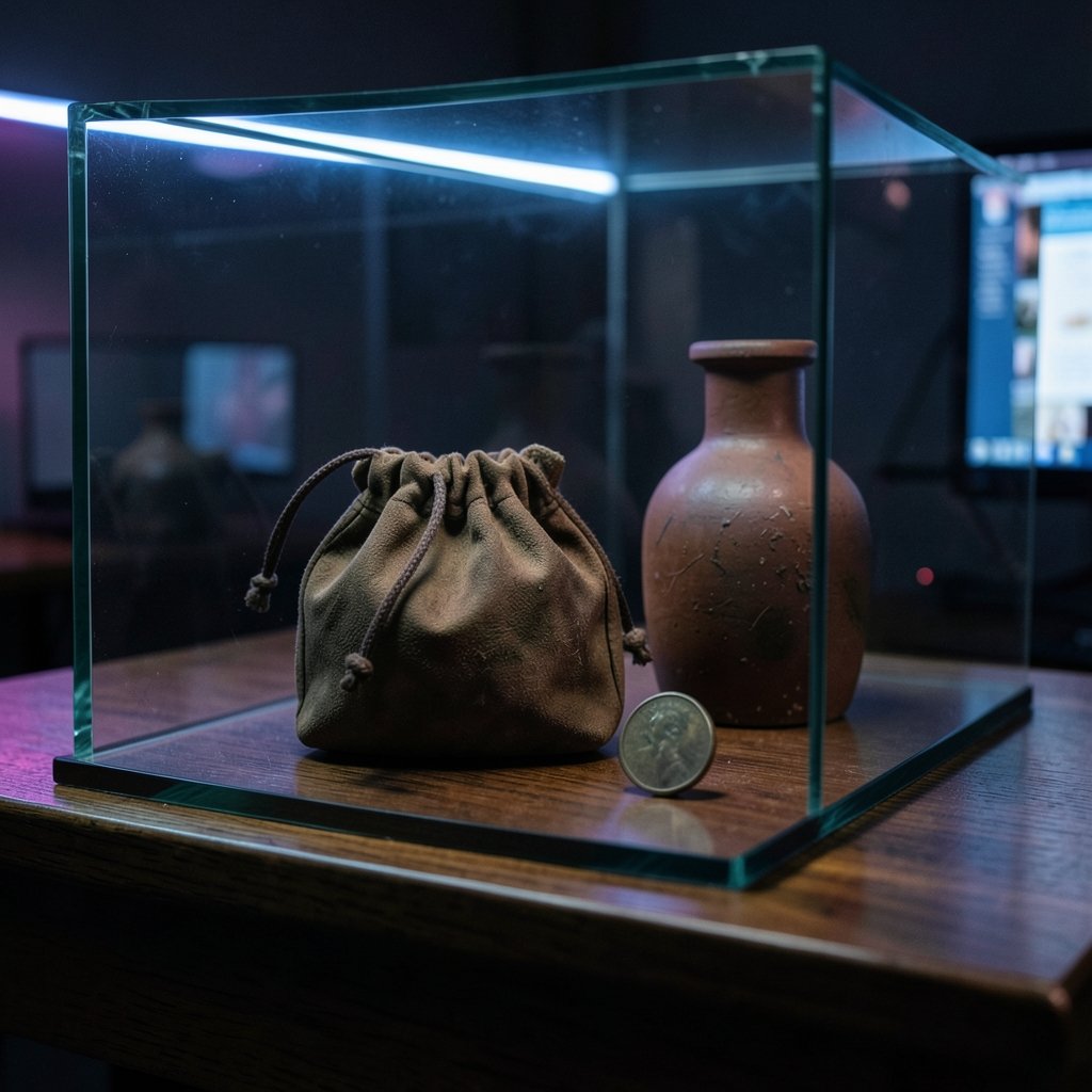
The idea of showing wealth as a bulging sack is old. In classical Greek and Roman art, a leather purse known as a marsupium often appears in scenes of commerce or alongside figures associated with money, and museum collections hold many examples of purses and money bags rendered in sculpture and pottery.
The version most people picture today, a tied sack with a dollar sign on it, is much newer. That motif took hold in 19th-century American political and editorial cartoons, where a fat sack of cash became shorthand for bankers, monopolies, and concentrated wealth. The top-hatted figure clutching a money bag is a stock caricature from that era, and it shaped how generations of illustrators have drawn the object since.
One common myth is worth correcting. The dollar sign itself is not ancient. It is generally traced to early-modern notation for the Spanish peso, so any claim that a dollar-marked sack appears in ancient art is anachronistic. If historical accuracy matters to a project, draw the sack without the symbol and let the shape do the work.
The Anatomy of a Convincing Money Bag
Before putting pencil to paper, it helps to understand what the drawing is actually made of. A good money bag has four parts, and each one carries meaning.
| Part | What it does | Common mistake |
|---|---|---|
| Sack body | Creates volume and weight | Drawing it as a flat oval |
| Cinched neck | Signals closure and tension | Making the pinch too wide |
| Tie or cord | Adds detail and realism | Leaving it as a plain line |
| Currency symbol | Communicates “money” instantly | Placing it off-center or too small |
The sack body should feel like it is holding something heavy. That means a wider bottom, a slight sag, and a curve that suggests fabric under strain. The neck should pinch sharply, because the tighter the cinch, the more the bag appears full.
The tie is where many drawings gain or lose charm. A simple band works, but a cord with two short ends sticking out adds movement and personality. Those loose ends also give the eye something to follow, which makes the whole drawing feel more finished.
Step-by-Step: Drawing a Money Bag in Eight Stages
Here is a reliable sequence that works for pencil, ink, or digital tools. It builds the drawing from the inside out, which is the order that prevents proportion problems later.
- Start with a light construction shape. Draw a loose circle or oval for the sack body. Keep the line faint, because it will be erased or covered.
- Add the neck. Draw two short curves rising from the top of the oval, angling inward toward each other. This is the pinch point.
- Connect the shoulders. Join the top of the oval to the neck with two gentle curves, so the sack flows into the pinch instead of meeting it at a hard corner.
- Draw the tie. Sketch a narrow band or cord wrapping around the narrowest part of the neck. Add two short tails hanging off to one side.
- Shape the bottom for weight. Widen the base slightly and flatten the very bottom, so the bag looks like it is resting on a surface rather than floating.
- Add the currency symbol. Place a dollar sign, euro sign, or coin motif on the front of the sack. Follow the curve of the fabric so the symbol looks painted on, not pasted on.
- Add folds and creases. Draw two or three short curved lines near the neck and along the sides where the fabric would bunch. Keep them sparse.
- Ink and erase. Go over the final lines with a darker stroke, then remove the construction marks. Add shading on one side and under the bulge to finish.
The order matters more than the individual strokes. Beginners who draw the symbol first often end up with a symbol that floats off the surface, because the sack underneath it is still being adjusted.
Getting the Dollar Sign Right
The currency symbol is the most recognizable element, and it is also the most frequently botched. Three rules help.
First, size it relative to the sack, not the page. A symbol that covers most of the bag looks like a logo. A symbol that sits comfortably in the middle of the front panel looks like a marking on fabric. Aim for roughly a third of the sack’s width.
Second, curve it. A perfectly straight dollar sign on a rounded sack reads as a sticker. Bending the vertical stroke and the S-curve slightly makes the symbol sit on the surface.
Third, decide what it means. A dollar sign signals American-style wealth and appears constantly in editorial cartoons. A euro sign, a pound sign, or a simple coin stack changes the tone. For generic savings illustrations, a coin or a stack of notes can be more flexible than a currency mark, and it avoids dating the drawing to one country.
Common Mistakes That Flatten a Money Bag Drawing
Most weak money bag drawings fail for the same handful of reasons. Recognizing them is half the fix.
The sack looks like a balloon. This happens when the body is drawn as a perfect circle or oval with no sag. Real fabric under weight droops. Adding a slight downward bulge and a flattened base solves it.
The neck is too wide. A wide neck makes the bag look open and empty. Pinch it hard, then let the shoulders flare out quickly.
The tie floats. If the cord does not visibly compress the fabric, it looks like a ribbon laid on top. Draw the neck line pinching inward right where the tie crosses it.
Folds are everywhere. Beginners often add too many creases, which turns a simple icon into a mess. Two or three well-placed folds do more than a dozen random ones.
The shading is flat. A single shadow along one side and a darker patch under the bulge gives instant volume. Shading the whole bag evenly does the opposite.
The symbol is crooked. Because the eye goes straight to the symbol, a tilted dollar sign makes the entire drawing look off balance even when the sack is fine.
Tools and Styles: From Doodle to Finished Illustration
The money bag adapts to almost any medium, and the choice of tool changes the character of the result.
| Style | Best tools | What it suits |
|---|---|---|
| Quick doodle | Ballpoint or fine-liner | Notes, whiteboards, casual sketches |
| Clean icon | Vector software, uniform stroke | Apps, logos, infographics |
| Cartoon | Brush pen, bold outlines | Comics, stickers, game art |
| Realistic | Graphite, blending stump | Still life, illustration portfolios |
| Painterly | Watercolor or digital brushes | Storybook and editorial art |
For icons, consistency of line weight matters more than detail. A money bag with a uniform stroke and one flat color reads clearly at small sizes, which is why it appears so often in app interfaces and game reward screens.
For cartoon work, thick outlines and a limited palette do the heavy lifting. A bold black contour plus two shades of one color is usually enough.
For realistic drawings, the challenge shifts to fabric. Studying how cloth bunches when tied, and how light falls across a rounded surface, matters far more than the currency symbol. In that style, many artists leave the symbol off entirely and let the shape and shading carry the meaning.
Where the Money Bag Symbol Shows Up
The money bag is one of the few drawings that appears almost everywhere. In video games, it is a standard pickup icon for coins and rewards. In cartoons and comics, it signals greed, jackpots, or a sudden windfall. In business graphics, it stands in for savings, revenue, and investment. In heraldry and coin design, purses and bags have long been associated with commerce and with officials such as treasurers.
The symbol also carries a cautionary edge. A bag of cash in a cartoon is often a warning sign, not a celebration, because the same imagery that means “jackpot” also means “someone is about to be fleeced.” That double meaning is why the money bag turns up in warnings about fraud, from fake prize notifications to schemes where victims are told to pay in gift cards and rarely see their money again, a pattern explored in this look at how the gift card scam works and why victims rarely get their money back. (Identity threat detection really costs where money goes)
For artists working on financial illustrations, that ambiguity is useful. A money bag can be aspirational or suspicious depending on the expression of the figure holding it, the lighting, and the surrounding context.
Drawing Money Bags for Different Purposes
The intended use should shape the drawing before the first line goes down.
For a logo or app icon, prioritize silhouette. Shrink the sketch to thumbnail size. If it still reads as a money bag, the shape is working. If it turns into a blob, simplify the tie and enlarge the symbol.
For a classroom or kids’ activity, keep the construction shapes visible and skip the shading. The goal is a sense of accomplishment, not polish.
For editorial illustration, lean into the cartoon history. A slightly exaggerated sack, a heavy outline, and a figure in a top hat place the drawing in a long visual tradition that readers recognize instantly.
For merchandise and stickers, leave breathing room around the outline. A money bag crammed against the edge of a sticker looks cramped once it is cut.
For game assets, test the drawing against a busy background. Icons that work on white often disappear against textured scenes, so a contrasting outline is worth adding.
How the Money Bag Became a Universal Icon
Part of the money bag‘s staying power is technological. The symbol crossed into digital culture early and never left. In Unicode, the money bag emoji is U+1F4B0, officially named “money bag,” and it has been available since Unicode 6.0 in 2010. That single character gave the drawing a standardized form that billions of people now see daily, and it reinforced the familiar silhouette: a plump sack, a tied top, and a currency mark. (Best camera bag for hiking)
The emoji also shows how flexible the symbol is. It gets used for actual money, but also for winnings, sales, pricing, and jokes about being broke. A drawing that can carry all of those meanings without explanation has earned its place.
Conclusion
The money bag drawing looks simple because it is built from simple parts, but the versions that stick in the mind are the ones where the artist made deliberate choices. A pinched neck that actually compresses the fabric. A base that looks weighed down. A symbol that curves with the surface instead of sitting on top of it. A tie with a bit of movement in its loose ends.
The symbol’s history rewards a little care too. The sack is ancient, the dollar sign is not, and knowing the difference keeps a historical illustration honest. Whether the goal is a quick doodle, a clean icon, or a cartoon full of meaning, the same principles apply: build the shape first, add the symbol second, and let weight and shading do the rest. Draw it once badly, fix the neck, and the second attempt will already look like money.
Frequently Asked Questions
What is the easiest way to draw a money bag?
Start with a light oval for the sack, pinch the top into a narrow neck, add a tie with two short tails, then place a curved dollar sign on the front. Finish with two or three fold lines and a shadow along one side. Building the shape before the symbol prevents proportion problems.
Why do money bags have a dollar sign on them?
The dollar-sign-on-sack motif is a modern American convention, not an ancient one. It spread through 19th-century political and editorial cartoons, where a fat sack of cash stood for bankers, monopolies, and concentrated wealth. Earlier depictions of money bags used plain purses with no currency mark.
Is the money bag symbol actually ancient?
The sack is ancient, but the dollar sign is not. Purses and money bags appear in classical Greek and Roman art, often as a leather purse called a marsupium. The dollar sign itself is early-modern, so a dollar-marked sack in an ancient setting is an anachronism.
What does the money bag emoji mean?
The emoji is officially named “money bag” and is coded as U+1F4B0. It was added in Unicode 6.0 in 2010. People use it for wealth, winnings, sales, and pricing, and also ironically for being broke or for jokes about greedy characters.
How do I stop my money bag drawing from looking flat?
Give the sack a wider, slightly flattened base so it looks heavy, pinch the neck tightly, and add one shadow along a side plus a darker patch under the bulge. Keep folds to two or three. Flatness usually comes from a perfectly round body and even shading.
Should I use a dollar sign or a coin in my money bag drawing?
It depends on the audience. A dollar sign signals American-style wealth and suits editorial cartoons. A euro or pound sign localizes the drawing. A coin or stack of notes is more neutral and works well for generic savings and finance illustrations that need to travel across markets.