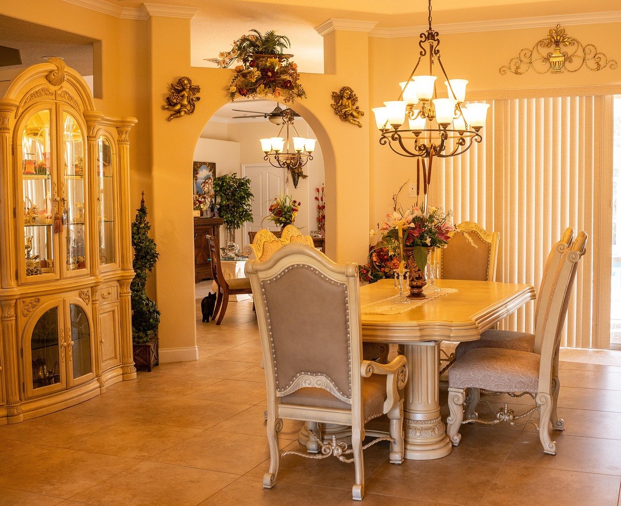
What is the first thing a guest notices when they walk into a dining room? It is rarely the chairs or the rug. It is the wall they face while sitting down. That blank stretch of plaster above the sideboard is either doing quiet work or fighting everything else in the room, and most people can feel the difference long before they can explain it.
Wall decor in a dining room carries more weight than in almost any other space. People sit still in this room. They look straight ahead for an hour or more. Art that seems charming in a hallway can become tiresome when it is the fixed backdrop to every meal. Getting it right comes down to scale, height, lighting, and a small number of practical decisions made before the first nail goes in.
Why the Dining Room Wall Is Harder Than It Looks
Most rooms let you spread decor across four walls. A dining room usually has one dominant sightline. The table faces a wall, and that wall becomes a stage.
There is also the furniture problem. Sideboards, buffets, and console tables all sit against walls and invite something above them. Hang too high and the art floats, disconnected. Hang too low and it crowds the lamp or the fruit bowl.
Then comes the light. Dining rooms get chandeliers, sconces, candles, and afternoon sun through a window. Every one of those sources changes how a framed print reads. Glossy glass throws a bright rectangle of glare straight into someone’s eyeline at dinner. Matte canvas absorbs light and can look muddy by 8 p.m.
The good news is that none of this requires taste or a big budget. It requires measuring, a bit of patience, and knowing which rules are real.
Start With Scale, Not Style
The single most common mistake is buying art that is too small. A modest framed print centered on a long wall looks like a postage stamp on an envelope. The wall wins.
A practical starting point: aim for wall art that covers roughly 60 to 75 percent of the width of the furniture below it. A 150 cm sideboard wants something in the 90 to 110 cm range, whether that is one wide piece or a grouping that reads as one shape.
For a bare wall with no furniture beneath it, think in terms of the table instead. Art centered over the dining table should feel related to the table’s width, not the room’s. A piece that spans about half the table width usually holds the space without dominating it.
Scale rules that actually work in practice:
- One large piece almost always beats four small ones on a narrow wall.
- A gallery wall needs a clear outer boundary, real or imagined, or it dissolves into noise.
- Vertical walls near doorways want vertical art; long walls above sideboards want horizontal art.
- If a piece feels slightly too big when you hold it up, it is probably right.
The Height Question, Settled
The most repeated number in wall decor is 145 cm to the center of the artwork. That figure comes from gallery practice, where the goal is a consistent eyeline for standing visitors. A dining room is a seated room, so the convention needs adjusting.
When people sit at a table, their eye level drops. Art hung at standing gallery height can feel like it is peering over the table rather than sitting with it. A workable approach is to relate the art to the furniture below it instead. Leave 15 to 25 cm of breathing room between the top of a sideboard and the bottom of the frame. That gap keeps the two elements reading as a pair.
For art hung on a bare wall with no furniture, center it around 150 to 160 cm from the floor. It will sit comfortably for both seated and standing viewers.
Before committing, tape paper templates to the wall at the planned position. Live with them for a day. This sounds fussy and takes ten minutes, and it prevents the most common outcome of all: a row of unnecessary holes and a piece hung 10 cm too high.
If the wall in question is shared with a television or a screen, the geometry gets more complicated, and the guidance in this breakdown of how gaming monitor vs tv room lighting changes viewing applies is worth reading before you commit to a layout.
Lighting Changes Everything
A dining room is a low-light room most evenings. That has real consequences for what belongs on the wall.
Glare is the first enemy. Glass-fronted frames act like mirrors under a pendant or a downlight. If a framed piece sits directly opposite a window or beneath a spotlight, consider matte glass, anti-reflective glazing, or a canvas print with no glass at all.
Fading is the second. Direct sun bleeds color out of prints, watercolors, and textiles over months and years. Anything hung on a sun-facing wall should be glazed with UV-filtering glass or moved to a wall that gets indirect light.
Color shift is the third and least discussed. Warm bulbs push artwork yellow; cool bulbs push it blue. A print that looked perfect in the shop can look sickly under a 2700K bulb. If the dining room uses warm lighting, warm-toned art holds up better.
The same principles show up in screen-heavy rooms, where reflections and ambient light decide whether a display looks crisp or washed out. Anyone weighing a Switch 2 vs switch OLED room lighting changes viewing setup will recognize the same glare-versus-contrast tradeoff that governs framed art.
Choosing What Goes on the Wall
There is no correct style, but there are categories that behave differently in a dining room.
| Decor type | Best for | Watch out for |
|---|---|---|
| Large single framed print | Clean, modern rooms; narrow walls | Glare on glass; needs correct scale |
| Gallery wall of 5 to 9 pieces | Long walls above sideboards | Visual noise if spacing is uneven |
| Canvas or wood panel | Sun-facing walls; casual rooms | Can look flat under low light |
| Mirror | Dark rooms needing light | Can reflect clutter along with light |
| Textile or tapestry | Softening hard, echoey rooms | Dust; fading in direct sun |
| Plate racks and sculptural objects | Traditional and eclectic rooms | Dusting; crowded if overfilled |
| Wall sconces and picture lights | Rooms used after dark | Wiring; heat near paper |
A mirror deserves special mention. It doubles the apparent light in a dim dining room and can make a small space feel generous. But it reflects whatever is opposite it, which is sometimes a pile of coats and a doorway. Check the reflection before buying.
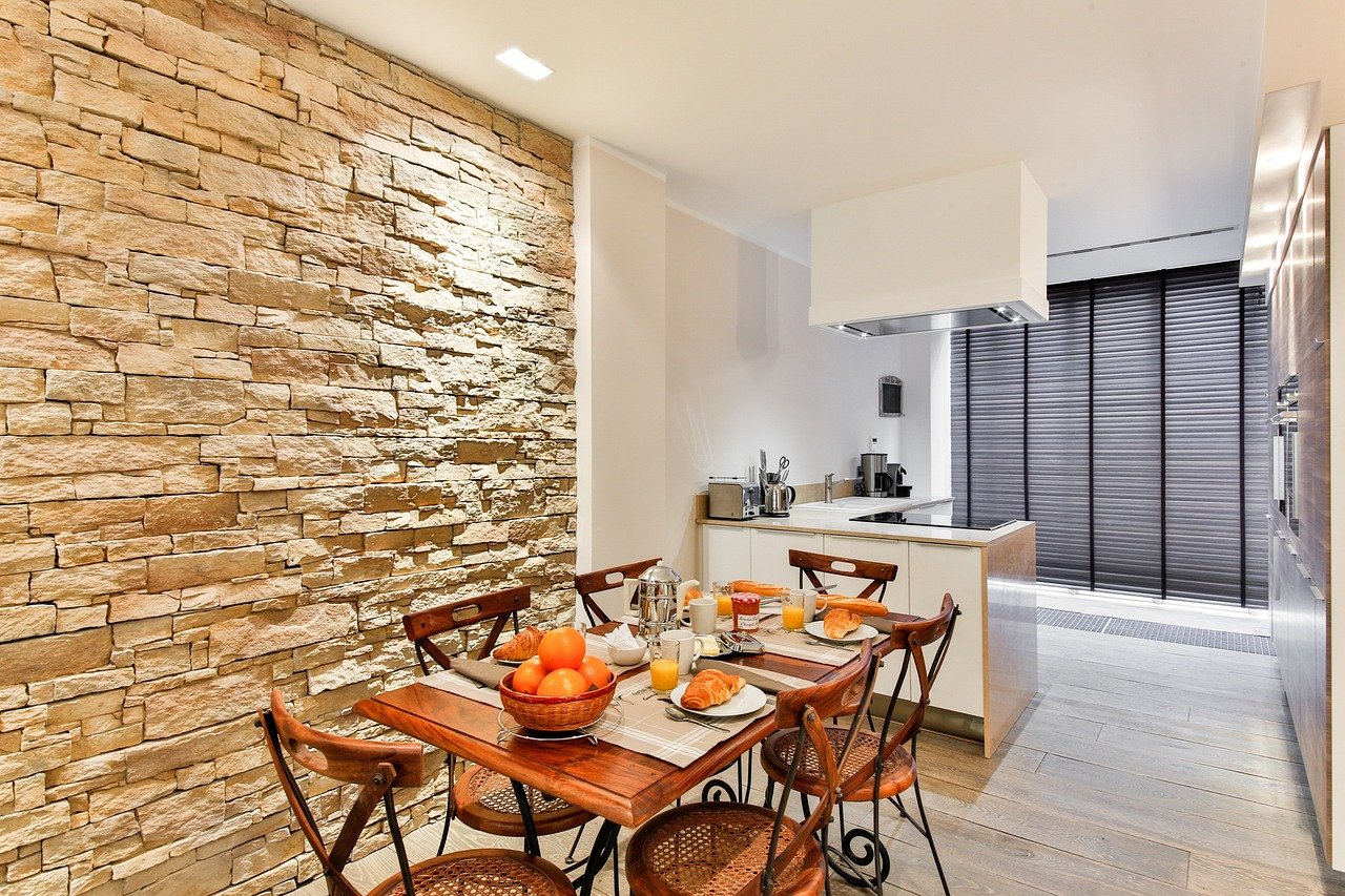
For rooms where the wall treatment itself is the decor, textured plaster, slatted wood, or a deep paint color can carry the space with almost nothing hung on it. That is often the most confident choice in a small dining room.
Practical Hanging: What Actually Holds
Weight is where enthusiasm meets physics. A large framed print with glass can weigh 8 to 12 kg. A heavy mirror can exceed 20 kg. Standard picture hooks are rated for far less.
Match the hardware to the wall and the weight:
- Plasterboard or drywall: use a hollow-wall anchor rated well above the item’s weight, or find a stud.
- Brick or masonry: use a masonry bit and a plug; never rely on adhesive strips.
- Plaster on lath (common in older homes): drill carefully, use a proper anchor, and expect the plaster to crumble if you rush.
- Rented homes: adhesive strips work for light pieces only, and they fail on textured or freshly painted walls.
Two hooks set a few centimeters apart, joined by a taut picture wire, keep a frame level far better than one hook. Frames drift because a single point of contact lets them pivot.
If the dining room wall is shared with a mounted screen, the load and cable planning get more involved, and a methodical approach pays off. This mount tv wall step by step guide that wont end tears covers the sequence in detail, and much of the anchoring logic transfers directly to heavy art.
Mistakes That Show Up Again and Again
A few errors account for most disappointing dining room walls.
Hanging everything at the same height across the whole house. Consistency is not the same as correctness. Each wall has its own furniture and sightlines.
Buying a set because it was on sale. Matching trios of small prints are the fastest route to a wall that looks like a hotel corridor.
Ignoring the frame. A cheap frame undermines good art, and a good frame rescues mediocre art. Frame color should relate to something in the room, whether that is the light fitting, the door handles, or the table wood.
Crowding the sideboard top. The wall and the surface below it compete for attention. If the art is busy, keep the sideboard nearly bare. If the wall is minimal, the surface can carry a lamp and a bowl.
Skipping the template stage. Almost every crooked, too-high, or badly spaced arrangement could have been avoided with paper and painter’s tape.
When You Cannot Decide
Some people stall for months because they cannot picture the outcome. That is a solvable problem now. A digital mockup lets you test scale and placement before buying anything. Tools that generate room concepts from a photo, such as this ai interior design generator for room ideas, are useful for exactly one job: checking whether a piece is the right size and position. Treat the output as a measuring aid, not a shopping list.
The same logic applies to screens and displays, where placement and ambient light decide the result more than the panel itself. Readers comparing handheld setups will find the same glare and contrast lessons in this look at Rog ally x vs steam deck oled room lighting changes viewing, and the underlying principle is identical: the room shapes what you see.
Conclusion
Dining room wall decor rewards a boring, methodical approach. Measure the furniture. Decide the sightline. Tape up templates. Check the light at the hour you actually use the room. Then buy.
The pieces people love most in a dining room are rarely the trendiest. They are the ones scaled correctly, hung at a height that respects seated viewers, and lit so they can be seen. Get those three things right and almost any style works. Get them wrong and even expensive art looks like an afterthought.
Start with one wall. One good decision beats a room full of rushed ones.
Frequently Asked Questions
How high should art hang above a dining room sideboard?
Leave 15 to 25 cm between the top of the sideboard and the bottom of the frame. This gap keeps the art and furniture reading as a single unit. Centering the piece at standing gallery height, around 145 cm, often looks too high in a room where people are seated.
How big should wall art be over a dining table?
Aim for a piece that spans roughly half the table’s width, or a grouping that covers 60 to 75 percent of the width of any furniture below it. Undersized art is the most common error. If a piece looks slightly too large when held in place, it is usually the better choice.
Can I hang art on a sun-facing dining room wall?
Yes, but protect it. Direct sunlight fades prints, watercolors, and textiles over time. Use UV-filtering glazing, choose a canvas or wood panel, or move the piece to a wall that receives only indirect light.
What is the best wall decor for a small dining room?
One large piece or a mirror usually works better than many small items. A mirror doubles the light and makes the space feel larger, provided it reflects something pleasant rather than a cluttered doorway. A single bold piece also avoids the busy look that small rooms suffer from.
How do I stop framed pictures from going crooked?
Use two hooks set a few centimeters apart, connected by a taut picture wire. A single hook lets the frame pivot. Two points of contact hold it level, and small rubber bumpers on the bottom corners reduce sliding.
Do I need to find a stud to hang a heavy mirror?
Yes, or use a hollow-wall anchor rated well above the mirror’s weight. Large mirrors can exceed 20 kg, far beyond what standard picture hooks hold. On plaster-on-lath walls, drill slowly and use a proper anchor, since the plaster surface crumbles easily under pressure.