What makes one stack of money drawing instantly believable while another looks like a flat rectangle with a rubber band around it? The answer is rarely artistic talent. It comes down to proportions, a few rules about how paper behaves when it is stacked, and knowing which details to include and which to leave out. Whether the goal is a quick icon for an app, a cartoon illustration, or a realistic pencil sketch, the same handful of decisions separates a convincing drawing from a forgettable one.
This guide walks through the geometry behind real banknotes, the practical drawing sequence that works for most skill levels, the mistakes that flatten a drawing, and the style choices that change what a stack of money communicates. It also covers the legal and practical side of publishing money imagery, because that trips up more people than the drawing itself. (Gift card scam works victims rarely get their money back) (Money)
Start With Real Banknote Proportions, Not Guesswork
The single biggest reason amateur money drawings look wrong is that the notes are drawn too tall. Real paper currency is long and narrow. A U.S. banknote measures roughly 6.14 by 2.61 inches, a ratio of about 2.35 to 1. That ratio has held since current-size notes were standardized in 1929, and it is the number to build a drawing around.
A quick way to apply it: sketch a rectangle about 2.35 times wider than it is tall, then scale everything from that template. If the drawing needs a stack of five bills, the total height of the stack is only a fraction of the length of a single note. Beginners almost always make the stack too chunky, because the brain remembers “pile of money” as a tall, fat object rather than a slim, wide one.
Currency varies by region, and that matters if the drawing depicts something specific. Euro notes, for instance, range from 120 to 153 millimeters in length depending on denomination, and each denomination has a different size and color. A drawing that mixes a euro color scheme with dollar-style proportions reads as generic money rather than either currency. (How much does it cost to produce currency and coin?)
| Currency detail | Approximate figure | Why it matters in a drawing |
|---|---|---|
| U.S. note ratio | 2.35:1 | Sets the base rectangle for every bill |
| Notes per standard strap | 100 | Defines how thick one banded bundle looks |
| Euro note length | 120 to 153 mm by denomination | Determines whether a euro stack looks correct |
| Typical stack of five notes | Slim and wide | Prevents the “fat brick” mistake |
The Drawing Sequence That Works
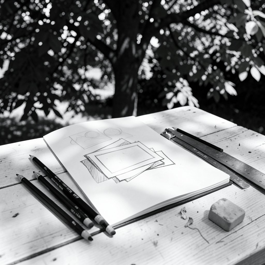
Most tutorials describe a three-stage approach, and it holds up because each stage solves one problem at a time. The order matters more than the technique.
- Draw the front note first. Sketch the full face of the top bill as a clean rectangle using the 2.35:1 ratio. This is the anchor. Everything else lines up behind it.
- Add the paper strap. A banded bundle is the most recognizable form of stacked money. Draw a narrow vertical or horizontal band across the note, roughly a tenth of the note’s length, and let it wrap slightly over the top and bottom edges so it reads as paper rather than a stripe of paint.
- Offset the note edges behind the front note. Each bill behind the first peeks out by a millimeter or two, with a slightly irregular line. Perfectly parallel edges look machine-made. Slight variation looks like paper.
- Add thickness to the sides. The visible edge of the stack is where the drawing gains weight. Draw thin horizontal lines along the side to suggest individual sheets, spacing them closer together toward the bottom.
- Place the shadows last. A soft shadow under the stack and a darker line where the strap meets the paper does more for realism than any amount of detail on the note face.
For a cartoon or icon version, stop after step three. For a realistic pencil drawing, steps four and five are where the time goes.
Why the Band Color Is Not a Decorative Choice
Here is a detail almost no tutorial mentions: in real cash handling, currency straps are color-coded by denomination. Standard practice assigns colors to bundles of a given value, so a brown band, a red band, or a blue band each implies a specific amount of money. A drawing with a colored strap is therefore making a quiet claim about how much cash is in the stack, whether the artist intends it or not.
For most illustrations this does not matter, and a neutral band color is the safer choice. But if the drawing is for a financial graphic, an infographic, or anything where the amount itself matters, matching the band color to the intended denomination adds accuracy that a knowledgeable viewer will notice. It is the kind of detail that costs nothing and signals care.
The same logic applies to the notes themselves. Real currency carries security features such as a security thread, a watermark, and color-shifting ink. Simple stack drawings almost always omit these, which is exactly why stylized icons read as “generic money” rather than a specific note. That is usually the right call. Adding security features to a small drawing creates visual noise without adding meaning.
The Mistakes That Flatten a Drawing
Certain errors show up again and again, and each one has a simple fix.
Drawing the stack too tall. Covered above, but it is the most common problem by far. Measure the ratio before committing to lines.
Making every edge perfectly straight. Real paper has slight variation. A wobbly edge reads as paper; a ruler-straight edge reads as plastic.
Ignoring the strap’s thickness. A strap is paper wrapped around paper. It has its own thickness and casts a small shadow. Drawing it as a flat colored rectangle is the fastest way to make a bundle look like a sticker.
Putting detail in the wrong place. Beginners spend time on the note’s face and rush the edges. Viewers read a stack of money through its silhouette and its edges, so that is where the effort belongs.
Skipping the shadow. A stack floating on white space looks like a logo. A stack with a grounded shadow looks like an object.
Using one flat color. Even a simple icon benefits from two tones: a lighter face and a slightly darker side. The contrast is what makes the form read at small sizes.
If the drawing is destined for a digital product, these same principles carry over into how the asset gets stored and served. A stack of images that breaks in production is its own kind of flattening, and the lessons in this breakdown of Amazon S3 production mistakes that quietly break your stack apply to illustration assets as much as to code.
Choosing a Style: Icon, Cartoon, or Realistic
The same subject supports wildly different treatments, and picking the right one early saves rework. The table below maps common use cases to the details each one needs.
| Style | Key features | Typical use | Time to draw |
|---|---|---|---|
| Flat icon | Two tones, no outline, simple strap | Apps, infographics, web UI | Minutes |
| Cartoon | Bold outline, exaggerated strap, simple face details | Editorial art, explainers, kids’ content | Under an hour |
| Semi-realistic | Correct proportions, edge lines, soft shadow | Presentations, finance articles | One to two hours |
| Realistic pencil | Full shading, visible sheet edges, cast shadow | Portfolios, fine art | Several hours |
The flat icon is the workhorse. It survives being shrunk to 16 pixels, it reproduces in one color, and it reads instantly. The trade-off is that it carries almost no information beyond “money.” The realistic version carries texture and weight but collapses at small sizes.
A useful rule: draw at the size the final image will appear. An icon designed at 2000 pixels and then shrunk to 32 will lose every detail that made it interesting. Start small, and add detail only where it survives.
Money Imagery in Context: What a Stack Communicates
A stack of money is never just an object in a composition. It signals value, savings, profit, bribery, gambling, or inflation depending on the surrounding elements. An artist who understands the symbolism makes better choices about angle, lighting, and setting.
A stack photographed or drawn from above, with a hand reaching toward it, reads as acquisition. The same stack seen from a low angle with harsh light reads as power or menace. A stack with a crumbling edge or a torn strap reads as instability. These are compositional decisions, not drawing decisions, but they determine whether the illustration works.
This matters more than ever because money imagery now sits alongside real financial concepts. Readers encounter central bank digital currency debates, identity fraud costs, and payment scams in the same feeds where they see cartoon cash. A drawing that implies easy, abundant cash sits oddly next to a story about a gift card scam where victims rarely get their money back. Illustrators who think about context produce images that support the story rather than undercut it. (Identity threat detection really costs where money goes)
There is also a practical angle for anyone building a media or content business around financial topics. Understanding how money imagery supports monetization is part of the same skill set, and the broader question of how to make money with AI now includes generating and licensing illustration assets.
Legal and Practical Notes Before You Publish
Drawing currency is generally fine. Reproducing it is where rules begin. Many countries restrict color reproductions of banknotes at or near actual size, and the specifics vary. A stylized drawing that is clearly an illustration, at a size or in a medium that could not be mistaken for real currency, is usually safe. A photorealistic scan printed at full size is not.
The safe habits are simple. Avoid exact reproductions at actual size. Change one clear detail, such as the portrait, the serial number, or the color scheme. Label the image as an illustration when it appears in a context where confusion is possible. And when a project involves currency at all, check the guidance for the specific country whose notes are depicted, because the rules are national, not universal.
For digital products, there is a second layer: file hygiene. A drawing exported at the wrong resolution, saved with the wrong color profile, or embedded in a page that loads it from an unstable path will fail in ways that have nothing to do with the artwork. The same discipline that keeps a drawing clean keeps the delivery clean.
Conclusion
A convincing stack of money drawing is not a test of talent. It is a test of observation. Get the 2.35:1 ratio right, draw the front note before anything else, wrap a strap that has real thickness, offset the edges with slight irregularity, and ground the whole thing with a shadow. Those five moves carry most of the weight, and they work at every skill level and in every style from flat icon to pencil study.
The details beyond that, like strap colors that imply a denomination and proportions that match a specific currency, are what separate a competent drawing from an accurate one. Choose them deliberately rather than by default. And before publishing, give a moment’s thought to what the image says in context and whether the reproduction rules for the currency depicted have been respected. Draw the object well, place it thoughtfully, and the stack will do its job.
Frequently Asked Questions
What is the correct proportion for drawing a stack of money?
Start with the note itself. U.S. banknotes are about 6.14 by 2.61 inches, a ratio near 2.35 to 1. Draw the front bill at that ratio, then build the stack behind it. Most beginners make the stack too tall because they picture a fat pile rather than a slim, wide bundle of paper.
How many bills are in a standard banded stack?
A standard currency strap holds 100 notes. That means one banded bundle is 100 bills, and the dollar value depends entirely on the denomination inside. For a drawing, this matters mainly for thickness: a bundle of 100 notes is thicker than most people sketch, but still far thinner than its length.
Do the colors on a money strap mean anything?
Yes. In real cash handling, straps are color-coded by denomination, so a specific band color implies a specific amount. Most illustrations ignore this and use a neutral band, which is fine for generic money. If the amount matters in the image, matching the band color to the intended denomination adds accuracy.
Should I include security features like watermarks in a drawing?
Usually not. Security threads, watermarks, and color-shifting ink are tiny and complex, and at drawing scale they become visual noise. Omitting them is exactly why stylized money icons read as generic cash rather than a specific note. Include them only in large, realistic work where the detail can actually be seen.
Is it legal to draw or publish pictures of money?
Drawing currency is generally acceptable, but reproducing it is regulated in many countries, especially at or near actual size and in full color. The reliable approach is to make the image clearly an illustration, avoid exact full-size reproductions, alter distinctive details, and check the rules for the specific country whose currency is shown.
What is the fastest way to draw a money stack that still looks good?
Draw the front note as a clean rectangle at the correct ratio, add a strap with visible thickness, offset two or three note edges behind it with slight irregularity, and finish with a soft shadow underneath. That sequence takes minutes for a flat icon and produces a drawing that reads clearly at almost any size.