Have you ever tried to doodle a dollar bill on a napkin and watched it turn into a sad green rectangle with a lopsided oval in the middle? That result is common. Drawing money looks simple because the subject is flat and familiar, but most people fail on the first attempt for the same handful of reasons. “Money drawing easy” is a learnable skill, and it breaks down into a repeatable process that anyone can follow with a pencil, a ruler, and about twenty minutes. (Identity threat detection really costs where money goes) (Drawing)
This guide focuses on the practical reading of the phrase: drawing banknotes as an art exercise. It covers the shapes behind the design, the order to draw them in, the mistakes that ruin most attempts, and the legal lines you should not cross if you plan to publish your work. There is also a short note on the other, older meaning of “money drawing,” because the phrase is genuinely ambiguous and it helps to know which one you are looking for. (Drawing)
Why money is harder to draw than it looks
A banknote is a designed object, and every element on it was placed by a committee, not by chance. The layout is dense, the patterns repeat at tiny scales, and the eye is unforgiving: a bill that is off by a few millimeters reads as “wrong” even to someone who cannot say why.
There is a second trap. Most people try to draw what they think a bill looks like rather than what is actually in front of them. They sketch a portrait from memory, invent the border, and guess at the numbers. The fix is boring but effective: put a real note (or a clear photo of one) beside your paper and treat it as a reference sheet, not a decoration.
The shape breakdown that makes it click
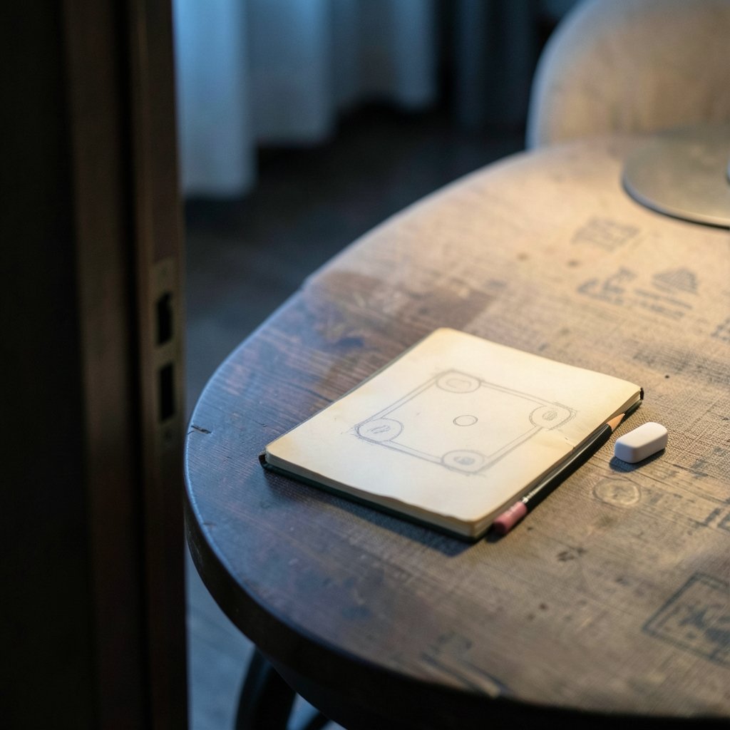
Easy drawing methods work by decomposing a complex subject into simple forms before adding detail. Money is a perfect candidate because it is built almost entirely from rectangles, circles, and ovals.
| Part of the note | Basic shape to start with | Why it helps |
|---|---|---|
| Outer border | Large rectangle | Sets your proportions and keeps everything inside the frame |
| Inner frame | Smaller rectangle, evenly inset | Creates the “border within a border” look most notes have |
| Portrait oval | Vertical ellipse | Gives the face a container so it cannot drift |
| Denomination corners | Four small squares | Anchors the numbers in matching positions |
| Center seal or emblem | Circle | Provides a focal point that is easy to place |
| Serial number strips | Two thin horizontal rectangles | Adds realism with almost no effort |
Once those six shapes are on the page, the drawing is roughly 70 percent complete. Everything after that is refinement, and refinement is where beginners either relax or panic.
Step by step: drawing a banknote in about twenty minutes
- Draw the outer rectangle lightly. Use a ruler and keep your pencil pressure soft. A hard, dark line is hard to erase later, and you will need to erase.
- Inset the inner frame. Measure the same distance from every edge. Uneven insets are the single most common reason a finished drawing looks crooked.
- Place the portrait oval. Center it horizontally, and sit it slightly above the middle rather than dead center. Real notes usually leave more room at the bottom for signatures and serial numbers.
- Block in the four corner squares. Keep them identical in size. If you are freehanding, draw the first one, then measure it and copy the measurement rather than eyeballing the rest.
- Add the center seal. A circle drawn with a coin as a template is fine. Nobody is grading you on purity.
- Sketch the serial number strips. Two thin rectangles, one near the top and one near the bottom, on opposite sides. This small detail does more for realism than almost anything else.
- Lightly block the portrait. Do not attempt a face yet. Just mark where the head, shoulders, and hair mass sit inside the oval.
- Add the lettering. Write the denomination in the corners and along the top. Keep the letters the same height, and use a light guide line so they sit level.
- Build the border pattern. Simple repeating shapes, like small dashes, dots, or tiny diamonds, read as engraving from a distance. Keep the spacing even.
- Erase the construction lines and darken the final outline. This is the step that makes the drawing look intentional rather than sketchy.
That sequence is the whole method. The reason it works is that it front-loads the decisions that are hard to fix later, like proportion and placement, and saves the forgiving work for the end.
What actually trips people up
A few mistakes show up again and again, and each one has a cheap fix.
Drawing too small. Beginners often work in a space the size of a business card, then discover there is no room for the border pattern. Work at least 15 centimeters wide. Bigger is easier.
Skipping the ruler. Freehand rectangles wobble. A ruler is not cheating; it is how you get the confidence to freehand later.
Over-detailing the portrait. The face is the hardest part of any note, and a shaky face sinks an otherwise good drawing. Simplify. Suggest the features with a few lines rather than chasing a likeness.
Pressing too hard on the first pass. Construction lines should be faint enough to vanish under an eraser. Save the dark pencil for the final outline.
Ignoring the paper’s texture. Banknote paper has a distinct feel, and while you cannot draw texture, you can suggest it with light, even shading in the background areas rather than scribbling.
Understanding the design you are copying
Knowing why a note looks the way it does makes the drawing easier, because you stop guessing at random details and start recognizing structure.
In the United States, the design of currency is not a matter of artistic taste. Federal law sets rules about whose portraits may appear on coins and securities and gives the Treasury Secretary authority over designs, which is why American notes follow such a rigid, standardized template. The familiar small-size greenback format that most people picture when they hear “dollar bill” dates to 1929, when notes were standardized into the shape we know today. If you want the full picture of how that system is codified, the text of the statute governing portraits and designs on US money explains the rules directly. (Cbdc digital currency central bank money going digital)
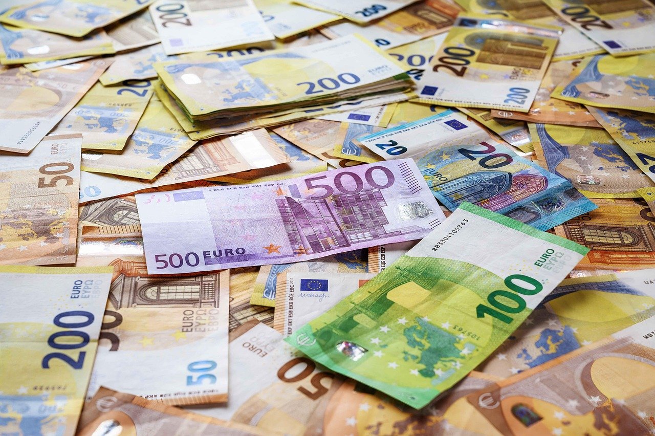
The euro offers a different and, for drawing practice, friendlier template. Its notes were chosen through a design competition in the mid-1990s, and the winning concept used windows, arches, and bridges rather than faces. That is a gift for beginners: architectural shapes are far easier to sketch convincingly than portraits, and the repeating arches create natural rhythm in a drawing.
Security features and why you should not copy them exactly
Modern banknotes carry features that are deliberately difficult to reproduce: raised intaglio printing, microprinting too small to read without magnification, color-shifting ink, and watermark portraits built into the paper itself. These exist to make counterfeiting hard, and they are also why “easy money drawing” tutorials simplify aggressively. You are drawing the impression of a note, not a replica.
That distinction matters legally as well as artistically. Many countries restrict reproductions of currency, and the rules are not always intuitive for hand-drawn work. If you plan to publish, sell, or print your drawings, check the official guidance for the currency you are depicting before you share it. Treat this as a genuine research step rather than a formality, because the rules vary by country and by how the image is used.
The other meaning of “money drawing”
Search the phrase and you will also find a completely different tradition: folk charms and spells intended to attract wealth. This is a belief practice with cultural history, not a method with demonstrated effects, and it belongs in a different conversation from art instruction. If that is what brought you here, the honest framing is that it is folklore, and it should be enjoyed as such.
The two meanings do overlap in one practical way, though: both attract people looking for a shortcut. In drawing, the shortcut is real but unglamorous, and it is repetition. In the folk tradition, there is no measurable outcome to point to. Knowing which one you are pursuing saves a lot of confusion.
Practice plan that produces visible progress
Improvement in drawing comes from volume and from specific, deliberate repetition. A workable routine looks like this:
- Ten minutes of shape drills. Fill a page with rectangles and evenly inset frames. Boring, but it fixes proportion fast.
- One full note per session. Complete the whole step sequence rather than perfecting one corner.
- Alternate currencies. Draw a dollar-style layout, then a euro-style one. Switching templates forces you to read the reference instead of relying on memory.
- Keep every attempt. Date them. Comparing week one to week four is the most reliable motivation there is.
- Copy from a photo, not from memory. Memory drifts toward caricature within a few attempts.
Most people see a clear jump in quality after about five completed drawings, which is a remarkably short runway for a skill that looks intimidating.
Tools that make the job easier without costing much
You do not need an art supply store. A mechanical pencil with a fine lead, a plastic eraser, a small ruler, and smooth paper will carry you a long way. A circle template or even a coin helps with seals and ovals. If you want to ink your drawing, a fine-tipped pen works better than a brush for the small repeating borders.
One underrated tip: use a light table or a window against daylight to trace your own construction lines onto a fresh sheet. Tracing your own work is not cheating; it is how you separate the planning stage from the finishing stage, and it produces much cleaner results.
Conclusion
Money drawing easy is really a story about order. Draw the big shapes first, place the anchors second, add lettering third, and save the portrait and border pattern for last. Keep your lines light until the very end, work bigger than feels natural, and always draw from a reference rather than from memory. The subject looks complicated because it was designed to be complicated, but the underlying structure is just rectangles, ovals, and circles arranged with discipline.
Whether you are doodling on a napkin or building a portfolio of illustrated currency, the same rules apply: simplify what is hard, standardize what repeats, and respect the legal boundaries around reproducing real notes. Do that, and the lopsided green rectangle becomes a drawing you would actually show someone.
Frequently asked questions
How long does it take to draw a realistic banknote?
A simple stylized note takes about fifteen to twenty minutes once you know the sequence. A detailed version with a shaded portrait and a full border pattern can take an hour or more. Beginners should expect their first attempt to take twice as long as their fifth. (Gift card scam works victims rarely get their money back)
Do I need to be good at drawing faces to draw money?
No. Most easy tutorials simplify or omit the portrait entirely and rely on layout, lettering, and border patterns for realism. If you do include a face, suggest the features with a few confident lines instead of chasing an exact likeness.
Is it legal to draw or publish pictures of money?
Rules vary by country and by how the image is used, and hand-drawn illustrations are not automatically exempt. If you plan to publish, sell, or print your drawings, check the official guidance issued for that currency before sharing your work.
What is the easiest currency to practice drawing?
The euro is generally easier for beginners because its design relies on windows, arches, and bridges rather than portraits. US notes are a good second step, since their rigid, standardized layout teaches proportion discipline.
Why does my drawing look wrong even when the shapes are right?
The usual culprits are uneven borders, lettering that is not level, and inconsistent spacing in repeating patterns. Check your inset measurements and use a faint guide line for text. Small inconsistencies read as errors to the eye even when the overall proportions are correct.
Does “money drawing” mean something other than art?
Yes. The phrase also refers to folk charms and spells meant to attract wealth, a cultural belief tradition rather than an art technique. It has no demonstrated effect, so it is best understood as folklore rather than a practical method.