
What comes to mind when someone says “money picture”? A photo of a stack of bills? A chart climbing on a news site? A portrait staring out from a banknote? Here’s the tricky part: money picture is not a standard term in English. It is not a fixed idiom in economics or finance, and you will not find it in a dictionary as a set phrase. That ambiguity is exactly why the phrase confuses people who run into it in a headline, a caption, or a conversation. (Banknote)
The good news is that the phrase almost always means one of three things, and each one is worth understanding on its own. This article unpacks all three, explains how currency portraits actually get chosen, how money-supply charts are built, and how to read “the money picture” of a household or a business without fooling yourself.
The three things “money picture” usually means
When people type or say “money picture,” they are usually reaching for one of these ideas:
| Meaning | What it refers to | Where you see it |
|---|---|---|
| A literal image of money | Photos of banknotes, coins, or currency art | Stock photos, news articles, social posts |
| A chart of money | Graphs of money supply, inflation, or balances | Central bank releases, finance journalism |
| A financial snapshot | A summary of someone’s income, debt, and savings | Budgeting advice, lending conversations |
A fourth, narrower reading exists too: the pictures printed on money itself, meaning the portraits and symbols on banknotes. That is a genuinely interesting subject, and it is where the rest of this article starts.
Why the faces on banknotes matter more than they seem to
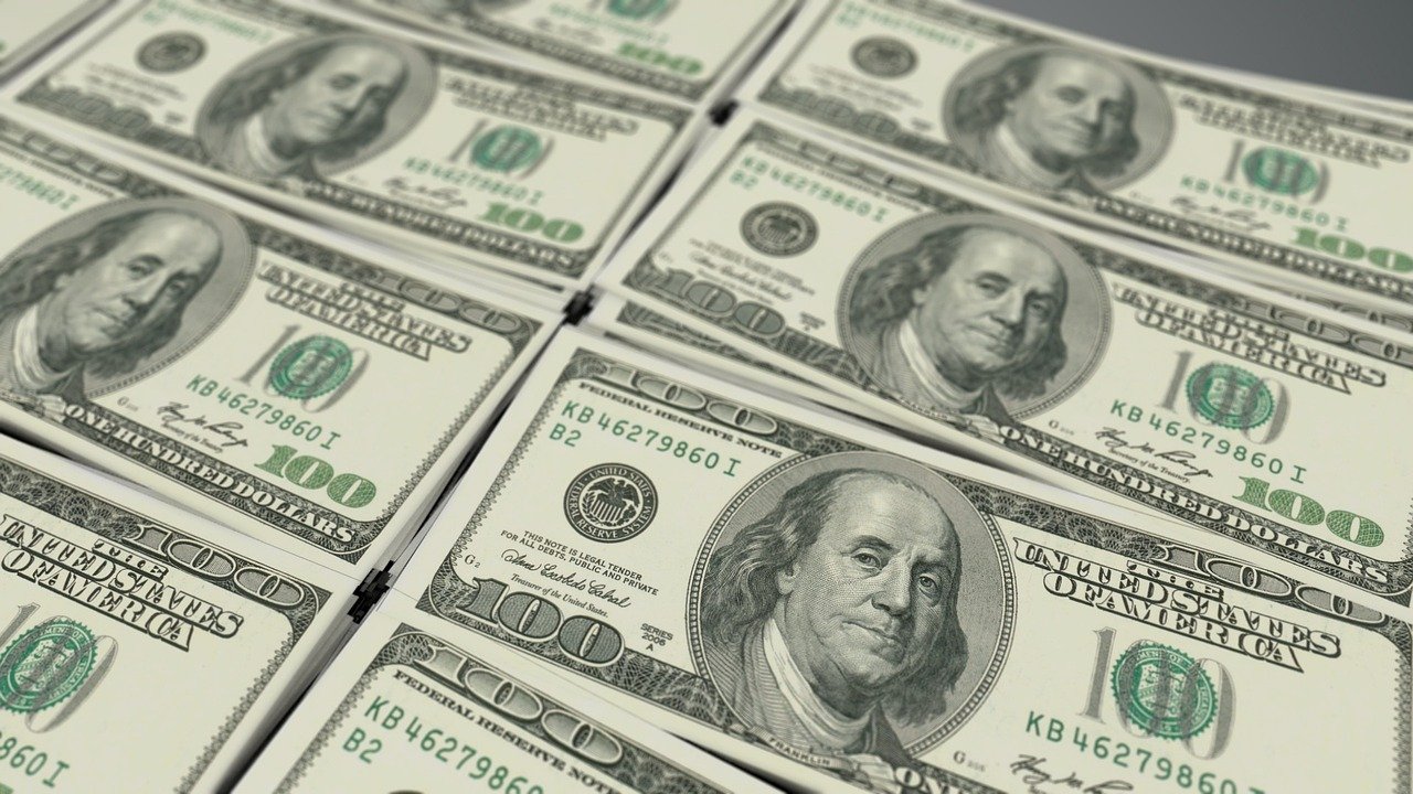
Currency is the most-reproduced artwork a country makes. Every note passes through millions of hands, which is why governments treat the choice of portrait as a serious decision rather than a design detail.
In the United States, the authority to put a face on money is not a matter of taste. It is written into law. The relevant statute, 31 U.S.C. § 5114 on engraving and printing plates and portraits, sets out the legal framework the Treasury works within. A long-standing restriction holds that only deceased people may appear on U.S. currency, a rule commonly traced to a statute from 1873.
The result is a set of faces that have barely changed in generations. George Washington has appeared on the $1 bill since 1869. Benjamin Franklin, a man who never held the presidency, occupies the $100 note. The lineup is a mix of law, tradition, and institutional inertia.
The most famous attempted change tells you how slowly this moves. In April 2016, the Treasury announced that Harriet Tubman would replace Andrew Jackson on the front of the $20 bill. The redesign was then delayed repeatedly, and the change had not been implemented as timelines kept slipping. Anyone writing about the $20 today should check current Treasury and Bureau of Engraving and Printing pages rather than trusting older articles, because the status has moved more than once.
How the euro takes a different approach
Europe solved the portrait problem by avoiding real people almost entirely. Euro banknotes show generic bridges, arches, and windows rather than actual monuments or national heroes. The designs were introduced with the currency in 2002, and a second series, the Europa series, began rolling out in 2013.
That series added a portrait of Europa, a figure from Greek mythology, as a security feature in the watermark and hologram. It is a clever trick: the face is cultural rather than political, so no member country feels slighted, and the portrait doubles as an anti-counterfeiting measure.
If you want to see how the designs and security features are documented officially, the European Central Bank’s banknote pages walk through each denomination, the Europa series, and what to check when verifying a note. It is a useful reference for anyone who handles cash and wants to know what the picture on the bill is actually telling them.
Security features: the hidden pictures on your money
Most people look at a banknote and see a portrait. Central banks see a layered security system, and the “pictures” embedded in a note are doing real work.
Modern notes from the 1990s onward carry watermarks, security threads, and color-shifting ink. Hold a note up to the light and a faint secondary image appears. Tilt it and ink changes color. These features are deliberately hard to photograph or scan, which is the whole point.
This is where the phrase “money picture” gets practical. If someone sends you a photo of a banknote as proof they have paid you, that photo proves nothing. Security features are designed to fail under a camera. A picture of money is not money, and treating it as evidence is one of the most common mistakes people make in online transactions.
The same logic applies to scams that use images of cash, gift cards, or payment confirmations to build trust. Fraudsters lean on the visual suggestion of money because it short-circuits careful thinking. A closer look at how these schemes play out shows why the image is never the proof, as this breakdown of how the gift card scam works and why victims rarely get their money back explains. The lesson is blunt: verify the balance in your own account, not in a screenshot someone sent you.
Reading a money supply chart without getting lost
The second common meaning of “money picture” is a chart of how much money exists. This sounds simple and is not.
Economists measure money in aggregates, typically labeled M0, M1, M2, and M3. The definitions vary by country, but the idea is a ladder: M0 is the narrowest base of physical currency and central bank reserves, while broader measures sweep in checking accounts, savings deposits, and other near-money assets.
In the United States, the primary dataset behind most money-supply charts is the Federal Reserve’s H.6 release, formally titled Money Stock Measures. The Federal Reserve’s H.6 Money Stock Measures release publishes the numbers weekly and monthly, and it is the source serious analysts cite rather than a redrawn chart on a blog.
Three practical tips for reading these charts:
- Check which aggregate you are looking at. A scary-looking spike in one measure may be routine in another.
- Check whether the figures are nominal or adjusted for inflation. A rising line means something different in each case.
- Check the date range. A two-year window can make a normal fluctuation look like a crisis.
Charts of money are also where the digital future of currency is being drawn. Central banks around the world are researching or piloting central bank digital currencies, which would appear in these statistics in ways the current framework was not built for. If that term is new to you, this plain explanation of CBDC digital currency and central bank money going digital covers what a CBDC is and why it would reshape the money picture. (How is U.S. currency designed and produced?)
The money picture of a household or a business
The third meaning is the most personal. When a lender, an adviser, or a worried parent asks about “the money picture,” they mean the whole financial situation at a glance: what comes in, what goes out, what is owed, and what is set aside.
A genuine money picture has four parts, and leaving any of them out distorts the view:
- Income, covering irregular and side income as well as the salary line
- Fixed costs, such as rent, insurance, and loan payments
- Variable spending, which is where most budgets quietly fail
- Assets and debts, including retirement balances and every outstanding obligation
The most common mistake is building the picture from memory. People consistently underestimate small recurring expenses and overestimate how much they saved. Pulling three months of actual statements fixes most of that error in an afternoon.
A second mistake is treating a snapshot as a trend. One good month is not a money picture; it is a data point. The picture only becomes useful when it covers enough time to show patterns, which usually means at least a full quarter.
Where technology fits in
Tools now do much of this work automatically. Budgeting apps categorize spending, and spreadsheet templates pull in bank feeds. Artificial intelligence has entered the space as well, with tools that analyze spending patterns or suggest savings. It is worth being clear-eyed about the limits: an AI can spot a pattern, but it cannot know that a large purchase was a one-time medical bill. For anyone curious about the realistic side of this, this look at how to make money with AI separates the practical uses from the hype.
Cost is the other factor people overlook. Security tools, monitoring services, and fraud protection all carry a price, and that price belongs in the money picture too. A clear accounting of where the spending actually goes, like this analysis of identity threat detection and where the money really goes, shows how easily protective spending hides in a budget.
Common mistakes when people talk about money pictures
A few errors come up again and again, and naming them saves time.
Confusing “money picture” with “money shot.” The established English idiom is money shot, a term from film production that has spread into general use. “Money picture” is not a substitute for it, and using the two interchangeably in writing will read as an error. A dictionary entry for the meaning of “money shot” settles the question quickly.
Assuming a photo of cash is evidence. It is not, for the reasons above. Security features exist to defeat cameras.
Treating one chart as the whole story. Money supply, inflation, and asset prices are related but distinct. A single line cannot carry all three.
Building a personal money picture from memory. Statements beat recollection every time.
Forgetting that currency design changes slowly. Articles about planned banknote redesigns go stale fast. Check the issuing authority before repeating a claim.
How to check a money claim in under five minutes
When someone presents a money picture, whether a chart, a photo, or a summary, a short routine catches most problems.
- Identify the source. Is it a central bank, a government agency, or an anonymous account?
- Find the original release. Most statistics trace back to one official publication.
- Check the units and the date range.
- Look for what is missing. A budget without debt, or a chart without inflation adjustment, tells a partial story.
- Ask what the presenter wants you to conclude. That question alone filters a surprising amount of noise.
Conclusion
“Money picture” is a phrase without a fixed definition, which makes it a small trap for writers and readers alike. It might mean a photograph of banknotes, a chart of the money supply, or a snapshot of someone’s finances. Each reading rewards a little knowledge: the law and tradition behind the faces on currency, the security features that make a photo of cash worthless as proof, the aggregates that give money-supply charts their meaning, and the four-part structure that turns a vague sense of finances into a real picture.
The thread running through all of them is the same. A picture of money is never the money itself. Whether it is a portrait on a banknote, a line on a chart, or a summary of a household budget, the image is a representation, and representations can mislead. The people who handle money well are the ones who check the underlying numbers rather than trusting the picture.
What does “money picture” mean?
It is not a standard English idiom. In practice it refers to one of three things: a literal image of currency, a chart showing money supply or financial data, or a snapshot of a person’s or organization’s overall finances. Context usually makes clear which one is meant.
Why do banknotes have portraits on them?
Portraits serve as both national identity and anti-counterfeiting. Complex human faces are hard to reproduce accurately, so they double as a security feature. In the United States, the choice of who appears is governed by statute and long-standing tradition rather than a single simple rule.
Is a photo of a banknote proof of payment?
No. Modern banknotes carry watermarks, security threads, and color-shifting ink specifically designed to be difficult to capture in a photograph or scan. A picture of cash, a gift card, or a payment confirmation should never be accepted as evidence that money has actually arrived. Check your own account balance instead.
What is the difference between M1 and M2?
Both are measures of money supply. M1 is narrower and typically covers physical currency plus checking deposits. M2 is broader and adds savings deposits and other near-money assets. Definitions vary by country, and central banks publish the official figures.
Is “money picture” the same as “money shot”?
No. “Money shot” is the established English idiom, originally from film production, and it has a different meaning entirely. Using “money picture” as a substitute will read as an error to most English speakers.
How far back does the plan to put Harriet Tubman on the $20 bill go?
The Treasury announced the change in April 2016, but the redesign was delayed repeatedly and had not been implemented as timelines kept slipping. Because the status has changed more than once, check current Treasury and Bureau of Engraving and Printing pages before relying on any article about it.