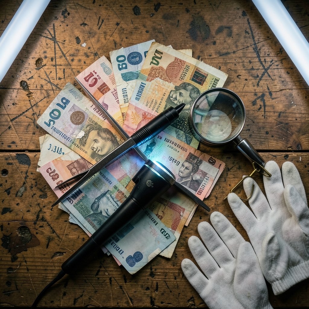
Have you ever looked closely at a banknote and wondered why it looks the way it does? Why does the American dollar stay stubbornly green while the euro looks like a travel brochure for architecture? Why do some countries put scientists on their cash and others put monarchs? The phrase money image gets thrown around a lot, and it usually means one of two things: the physical design of currency, or the way people see and trust money itself. Both are worth understanding, because both shape how we spend, save, and spot fakes. (How is U.S. currency designed and produced?)
This article unpacks both sides. It looks at the design decisions behind banknotes, the security features that protect them, and the survey data that shows how public confidence in cash rises and falls. Along the way, it separates practical knowledge from common myths.
The two faces of the “money image” idea
The term is not a formal concept in economics or law. It is a loose phrase, and that looseness causes confusion. In everyday use, it splits into two clear meanings.
The first is visual design: what a note or coin actually looks like. That covers portraits, seals, colors, symbols, and the security features baked into the paper or polymer. The second is public perception: how much people trust a currency, how often they use cash, and what they believe money represents.
These two meanings interact. A note with weak security features damages trust when fakes spread. A note that excludes blind users damages trust in a different way. Design and perception are not separate topics. They feed each other.
A third, vaguer meaning exists too: the cultural image of money in film, advertising, and art. That sense is real but hard to document, so this article focuses on the two meanings with solid evidence behind them.
Why currency design is a legal matter, not an artistic one
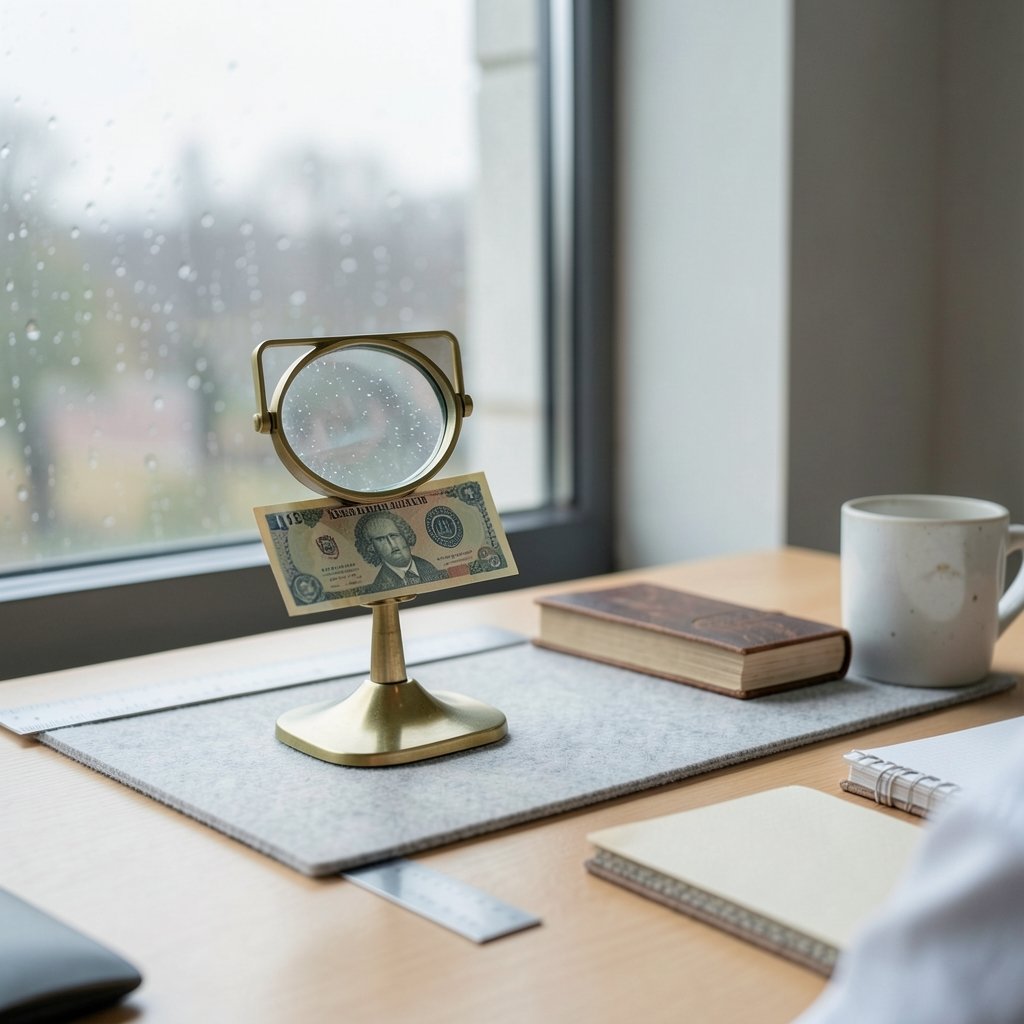
People assume a government picks a pretty picture and prints it. In reality, currency design is tightly regulated. In the United States, federal law specifies elements that must appear on paper money, including the legal tender obligation statement and the Treasury seal. The modern look of US notes traces back to the small-size series introduced in 1928, which standardized dimensions and layout.
That legal framing matters for anyone researching the money image of a specific note. If you are trying to identify a bill, date it, or check whether it is genuine, the design elements are your evidence. The obligation text, the seal, the serial number format, and the portrait all follow rules.
The same logic applies elsewhere. The European Central Bank controls euro note design. The Bank of England controls sterling. Each central bank publishes the specifications, which is why design details can be checked rather than guessed.
Security features: the arms race printed on paper
Redesigns rarely happen for aesthetic reasons. They happen because counterfeiters catch up. The US Bureau of Engraving and Printing describes how redesigned notes add features such as color-shifting ink and 3-D ribbons. The most famous example is the $100 note with the blue 3-D ribbon, which entered circulation on October 8, 2013.
Here is a practical comparison of common security features and what they actually do:
| Feature | What it looks like | How to check it |
|---|---|---|
| Color-shifting ink | Number changes color when tilted | Tilt the note slowly under light |
| 3-D ribbon | Woven blue strip that appears to move | Tilt and watch the bells shift |
| Watermark | Faint portrait visible from both sides | Hold up to a light |
| Security thread | Thin embedded line | Backlight the note |
| Raised printing | Slight texture on the portrait | Run a finger across it |
| Transparent window | Clear panel in polymer notes | Hold against a dark background |
The transparent window is a polymer-only feature. The Bank of England explains how polymer banknotes work and why the material change delivered both durability and new security options. The first polymer note, the £5 featuring Winston Churchill, was issued on September 13, 2016.
A common mistake people make is checking only one feature. Genuine notes pass several tests at once. Counterfeits often get the look right but fail the feel or the tilt test. The practical rule is simple: check at least three features, and check them in different lighting.
Accessibility changed how money looks
One of the most underrated forces shaping the money image is accessibility law. In 2008, a federal court ruling in American Council of the Blind v. Paulson found that US paper money discriminated against blind and low-vision users. The Treasury responded by adding tactile features, including raised printing, to redesigned notes.
This is a good example of design serving people rather than tradition. A note that cannot be distinguished by touch forces blind users to rely on strangers or devices. Raised intaglio printing gives them an independent check.
For anyone handling cash regularly, this has a practical upside. The raised texture is one of the fastest authenticity checks available, and it costs nothing to perform. If the portrait feels flat and smooth, that is a warning sign.
What other countries put on their money, and why
Portraits are a choice, not a requirement. The euro deliberately avoids real people and real monuments. Euro banknotes, which entered cash circulation on January 1, 2002, use generic architectural styles instead: classical, Romanesque, Gothic, Renaissance, Baroque, and iron-and-glass. The idea was to avoid favoring one member state’s heroes over another’s. The European Central Bank has since announced a redesign process for future notes.
The United Kingdom took a different route, putting national figures on polymer. The United States puts presidents and founders on notes, with the Secretary of the Treasury holding statutory authority over whose portrait appears. That authority became a public controversy in 2016, when a plan to place Harriet Tubman on the $20 note was announced, then delayed. In 2021 the Treasury said it would move forward. As of the most recent verified reporting, the note had not entered circulation.
The lesson for readers is that who appears on money is a political decision, not a fixed law of nature. When a new portrait is announced, treat it as a proposal until the note is actually printed and issued.
Reading money images: a practical checklist
If you are trying to identify, date, or verify a note, or you simply want to understand what you are looking at, a structured approach beats guesswork.
- Identify the country and issuing authority from the text and symbols.
- Note the portrait and any accompanying title or signature.
- Check the serial number format against known patterns.
- Compare the security features against official specifications.
- Look for the date or series marker, which is often small and near the portrait.
- Cross-check the design against a reference image from a reliable source.
That last step is where image skills pay off. If you have a photo of a note and need to confirm what it is, learning how to find the original source of an image helps you trace where the picture came from and whether it has been altered. The same technique works for spotting fake currency photos circulating on social media, which are often recycled or edited. (How to reverse image search on android)
Reverse image tools are useful here, and knowing how to reverse image search on Android means you can do it from your phone in seconds. Broader image search techniques for finding images online add another layer, letting you match a design detail against official reference material rather than trusting a single search result. (Best ai text to image generator free)
Trust in cash: what the surveys actually show
The perception side of the money image is measurable. Central banks survey consumers about payment habits and confidence. The European Central Bank runs a study on payment attitudes in the euro area, known as SPACE. The 2022 edition found that cash remained the most common point-of-sale payment method in the euro area, although its share had fallen.
Sweden tells a sharper story. The Riksbank has documented a steep decline in cash use, to the point where cash is close to marginal in everyday life for many Swedes. That shift changes the money image in a literal sense: if people rarely see cash, they lose the visual familiarity that helps them spot a fake.
Counterfeiting rates are the standard metric for how well a currency’s image holds up. The European Central Bank publishes the number of counterfeit euro notes detected per million genuine notes in circulation, typically a few dozen per million per year. That is a tiny fraction, and it is a useful counterweight to viral claims that counterfeiting is out of control.
Two mistakes are common when reading these numbers. First, people confuse detected counterfeits with total counterfeits; many fakes never surface in official statistics. Second, people assume a rise in detections means more fakes, when it can simply mean better detection.
How digital money is reshaping the picture
The money image is no longer only about paper. Digital payments have changed what people picture when they hear the word money. For many younger users, money is a number on a screen, not a portrait on a note. (Identity threat detection really costs where money goes) (Money)
This has real consequences. When cash is unfamiliar, security features stop being intuitive. Someone who has never tilted a note to watch ink shift will not know to try it. Central banks and consumer bodies have responded with education campaigns, but the gap is real.
There is also a fraud dimension. Scams that rely on the image of money, such as fake payment screenshots or forged transfer confirmations, exploit the fact that people trust what they see on a screen. Understanding how the gift card scam works and why victims rarely get their money back is a useful reminder that visual proof of payment is not proof of payment. A screenshot can be edited in seconds.
The same caution applies to AI-generated imagery. Tools that produce realistic pictures of banknotes, receipts, or payment confirmations are widely available. Knowing how an AI image generator without a prompt works, and how easy it is to produce convincing visuals, should make anyone more skeptical of a photo offered as evidence.
Conclusion
The money image is two things at once: a carefully regulated design and a fragile public perception. The design side is documented, checkable, and full of practical signals, from color-shifting ink to raised printing. The perception side is measured by surveys and counterfeiting statistics, and it moves slowly but decisively.
The practical takeaway is straightforward. Learn three security features and check them every time. Treat portraits on notes as political decisions rather than permanent facts. And stay skeptical of any image of money that arrives on a screen without a way to verify it. Cash is designed to be checked; digital images of cash are designed to be trusted. Only one of those deserves your confidence.
Frequently asked questions
What does “money image” mean?
It usually means one of two things: the visual design of currency, including portraits and security features, or public perception and trust in money. It is not a formal term in economics or law, so context decides which meaning applies.
Why do US dollar bills all look similar?
US note design follows statutory requirements and a standardized layout dating to the small-size series of 1928. Redesigns focus on security and accessibility rather than dramatic visual change, which keeps recognition high and counterfeiting harder.
Why does the euro use buildings instead of people?
The euro was designed to avoid favoring any single member state’s national figures. Euro notes use generic architectural styles instead of real monuments or people. The European Central Bank has announced a redesign process for future notes.
How can I tell if a banknote is fake?
Check at least three features in different lighting. Tilt the note to test color-shifting ink, backlight it to check the watermark and security thread, and feel the portrait for raised printing. A note that fails the feel test is worth a closer look.
Do polymer notes last longer than paper notes?
Yes. Polymer notes are more durable and resist tearing and moisture better than paper. They also allow transparent windows, which are difficult to reproduce. The Bank of England issued its first polymer note, the £5 featuring Winston Churchill, on September 13, 2016.
Is cash use actually declining?
In some countries, clearly. Sweden’s Riksbank has documented a sharp fall in cash use. In the euro area, the picture is mixed: the 2022 SPACE study found cash remained the most common point-of-sale payment method, even as its share declined.