
When was the last time you opened a product box, pulled out the manual, and actually enjoyed reading it? Probably never. Most people toss the booklet aside, poke at the product until it works, and only dig through the paperwork when something breaks. That habit tells you something important: a user manual is not a formality. It is either a tool that helps people succeed or a pile of paper that wastes everyone’s time.
This guide walks through what a user manual is, why it matters beyond legal cover, and how to write one that survives contact with real users. It covers structure, plain language, standards, accessibility, and the mistakes that quietly ruin otherwise decent documentation.
What Counts as a User Manual?
A user manual (also called a user guide, instruction manual, or handbook) is a document that gives people the information they need to use a product or system. The terminology is not standardized. Industries swap “manual,” “guide,” “handbook,” and “instructions” freely, and no single authority owns the definition. (Drive manual car clutch control gear shifts hill starts)
That looseness matters in practice. A one-page quick-start card, a 200-page service manual, and an in-app help center can all count as user documentation. What they share is purpose: helping someone operate, maintain, or troubleshoot something without outside help.
Manuals also serve a second role that draws less attention. In many markets, they are a legal requirement. Under US product-liability law, inadequate warnings or instructions can support a claim of defective design or failure to warn, a principle addressed in the Restatement (Third) of Torts: Products Liability. A thin manual can be unhelpful, and it can be a liability.
Why Most Manuals Fail Before They Are Written
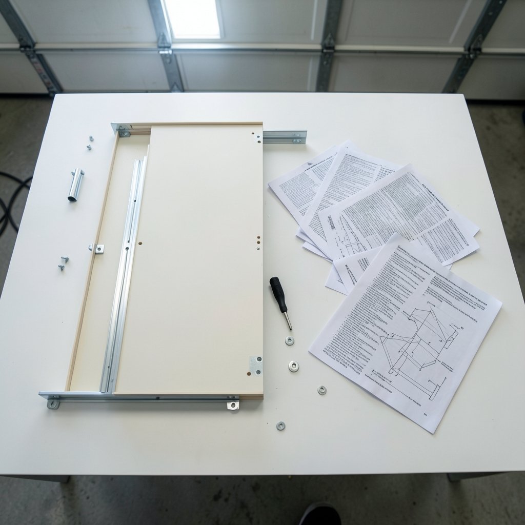
The biggest documentation problems start long before anyone types a sentence. They start in planning.
Three failure patterns show up again and again:
- The manual is written last. Engineering finishes, marketing approves the box, and someone is handed the product a week before launch and told to “write the manual.” No user testing, no review cycle, no time to fix anything.
- The manual is written for the wrong reader. Engineers write for engineers. The person assembling a bookshelf at 11 p.m. gets a lecture on torque specifications instead of a clear diagram.
- The manual covers everything and answers nothing. Exhaustive reference material looks thorough but buries the two or three tasks most users actually need.
What works in practice is boring and effective: define the audience and their top tasks first, write those tasks before anything else, and test the draft on someone who has never seen the product. If a first-time user gets stuck, the manual is wrong, not the user. (Mfa pricing explained drives cost per user 2026) (User guide)
What Standards and Regulations Expect
You do not need to memorize standards to write a good manual, but knowing they exist helps you argue for proper resourcing.
ISO/IEC Guide 37 addresses instructions for use of consumer products and how they should be written and presented. IEC 82079-1 is the central international standard for preparing information for use, covering planning, content, and presentation; a second edition was published in 2019. In the European Union, machinery must be supplied with instructions for use under the Machinery Directive 2006/42/EC, which is being replaced by the Machinery Regulation (EU) 2023/1230.
These frameworks share a common thread: instructions must be complete enough, clear enough, and safe enough that a reasonably careful user can operate the product without harm. That is a useful benchmark even for products with no legal mandate.
Structuring a Manual Around Real Tasks
A good manual follows the order in which people actually encounter the product. The table below shows a structure that works for most consumer and light commercial products.
| Section | Job it does | Common mistake |
|---|---|---|
| Safety information | Prevents harm before anything else happens | Hiding it in an appendix |
| Setup and assembly | Gets the product working | Assuming tools or skills |
| Core tasks | Covers the 3–5 things most users do | Listing every feature equally |
| Maintenance | Keeps the product working | Omitting cleaning and storage |
| Troubleshooting | Solves predictable problems | Blaming the user |
| Specifications and support | Answers edge questions | Forgetting contact details |
Two structural habits pay off. First, front-load safety. Warnings that appear after the assembly steps are warnings nobody reads. Second, organize by task, not by component. Users think “how do I pair my phone,” not “chapter 4, section 2.3, Bluetooth subsystem.”
For digital products, the same logic applies to help centers and onboarding flows. If you are documenting something like a cloud service that processes data closer to users, the explanation of cloud edge orchestration benefits when processing closer to users is itself a form of user manual, and it succeeds or fails on the same clarity principles.
Writing in Plain Language
Plain language is not dumbing down. It is removing friction.
The US Plain Writing Act of 2010 requires federal agencies to use clear communication in public documents. It does not govern commercial manuals, but it is widely cited as a model, and its core advice transfers directly: use short sentences, active voice, and everyday words.
Practical rules that work:
- One instruction per sentence. “Press and hold the power button for three seconds” beats “the power button, when held, initiates the startup sequence.”
- Put the action first. Start with the verb.
- Name the thing the user sees. If the button says START, call it the START button.
- Cut hedging. “You may wish to consider” becomes “consider” or disappears.
- Use consistent terms. If it is a “tray” on page 3, it is not a “drawer” on page 9.
Readability formulas such as the Flesch–Kincaid tests can estimate how hard a draft is to read. Treat scores as a smoke detector, not a verdict. A score will not tell you whether a diagram is confusing, but it will flag sentences that sprawl.
There is also a well-established design philosophy behind good instructions. John M. Carroll’s minimalist approach, laid out in The Nurnberg Funnel, argued that manuals should support learning by doing rather than dumping exhaustive reference material on beginners. That idea is now standard in good onboarding design for everything from apps to hardware.
Visuals, Accessibility, and Digital Manuals
A diagram often replaces three paragraphs. But visuals only help if they are clear, labeled, and placed next to the step they support.
For manuals published online, accessibility is not optional. The Web Content Accessibility Guidelines (WCAG) 2.2 became a W3C Recommendation on 5 October 2023, and they matter directly for online manuals: alt text for diagrams, sufficient color contrast, keyboard-navigable content, and headings that screen readers can follow. A manual that only works for sighted mouse users excludes a meaningful share of the audience.
Digital formats also change what is possible. Searchable help centers, short task videos, and printable quick-start sheets can coexist. The trick is deciding which format serves which moment. Someone assembling furniture wants paper or a phone screen propped nearby. Someone troubleshooting an error code wants a search box.
Common Mistakes That Quietly Ruin Manuals
Even well-funded documentation teams trip over the same issues. Watch for these:
- Translation done too late. Writing in idioms and then translating produces manuals that read strangely in every language. Write in controlled, simple English from the start.
- No version control. A manual that does not match the shipped product is worse than no manual. Track revisions and print the version and date.
- Warnings without consequences. “Do not do this” is weak. “Do not do this, or the battery may overheat” tells the reader why it matters.
- Ignoring the return and support path. Many readers open the manual only when something is broken. Give them a clear route to help.
- No testing. One session with five first-time users will surface more problems than a week of internal review.
Structured authoring standards can help at scale. DITA (Darwin Information Typing Architecture) is an OASIS XML standard for topic-based technical documentation, with DITA 1.3 approved as an OASIS Standard in 2015. Topic-based writing lets teams reuse the same safety section or setup step across multiple products instead of rewriting it each time.
Building a Manual Production Process
A repeatable process beats heroic effort. A workable sequence looks like this:
- Define the audience and top tasks. Interview support staff; they know what confuses people.
- Draft the task sections first. Safety and setup before features.
- Review with engineering for accuracy and with support for relevance.
- Test with first-time users. Watch where they pause.
- Revise, then check readability and accessibility.
- Publish with a version number and a feedback channel.
- Update after launch. Real support tickets are free research.
The feedback channel is the step most teams skip. A short “was this helpful?” prompt or a support email address turns a static document into a living one. Manuals that improve over time almost always have a visible way for readers to complain.
Conclusion
A user manual is a promise that the product will not leave you stranded. The best ones are written early, organized around real tasks, tested on real people, and kept in sync with what actually ships. Standards and regulations set a floor, but clarity is what earns the manual a place on the desk instead of in the recycling bin. Whether you are documenting a coffee machine or a software platform, the same rule holds: write for the person holding the product, not for the person who built it.
Frequently Asked Questions
What is the difference between a user manual and a user guide?
In practice, very little. Both terms describe documentation that helps someone use a product, and industries use them interchangeably along with “instruction manual” and “handbook.” The distinction, when one is made, is usually about scope or formality rather than any official definition.
Are user manuals legally required?
It depends on the product and the market. In the European Union, machinery must be supplied with instructions for use under the Machinery Directive 2006/42/EC, which is being replaced by the Machinery Regulation (EU) 2023/1230. In the US, inadequate instructions can support a failure-to-warn claim in product-liability cases. Many products have no explicit requirement, but good instructions still reduce risk.
How long should a user manual be?
As long as the tasks require and no longer. A simple consumer product may need four pages; complex equipment may need a full reference. Length is not a quality signal. What matters is that the most common tasks are easy to find and follow, and that safety information appears before anyone starts using the product.
What reading level should a manual target?
Aim for clear, plain language rather than a specific grade score. Short sentences, active voice, and everyday words do most of the work. Readability formulas such as Flesch–Kincaid can flag overly complex passages, but they cannot judge whether a diagram makes sense, so pair scores with user testing.
How do I test whether a manual works?
Give the product and the draft manual to someone who has never seen either, and ask them to complete the main tasks while you watch. Do not help. Where they hesitate, the manual has a gap. Five testers will usually reveal the biggest problems, and support tickets after launch will reveal the rest.
What makes online manuals different from printed ones?
Online manuals can be searched, updated instantly, and made accessible to screen readers, but they must meet accessibility expectations such as the Web Content Accessibility Guidelines (WCAG) 2.2, which became a W3C Recommendation on 5 October 2023. They also need version control so readers can tell which product revision the instructions match.