A 400-square-foot apartment can feel generous or cramped depending on what’s inside it. That’s the strange math of small-space living: the less you put in a room, the more room you seem to have. Minimalism isn’t about living with nothing. It’s about choosing carefully, then letting those choices breathe. For anyone squeezed into a studio, a narrow townhouse, or a starter flat, that principle is less a style preference than a survival strategy.
This guide walks through the ideas that actually work in practice, the mistakes that quietly shrink a room, and the design habits that separate a calm small home from a cluttered one.
Why minimalism suits small homes so well
Every object in a small room competes for attention. A packed shelf doesn’t just take up 12 inches of wall; it fragments the visual field into dozens of small shapes, and the eye reads that busyness as tightness. Strip the surfaces back and the same square footage suddenly reads as open space.
There’s a practical side too. Fewer possessions mean fewer things to move when you clean, fewer surfaces to dust, and less friction in daily routines. Minimalism in a small home isn’t an aesthetic flex. It’s a way of making a limited footprint work harder. (Minimalism)
The trap is treating minimalism as an all-or-nothing purge. In practice, the homes that feel best are selective, not empty. They keep the objects that earn their place and remove the ones that don’t. (Minimalism)
Start with light colors, but understand why they work
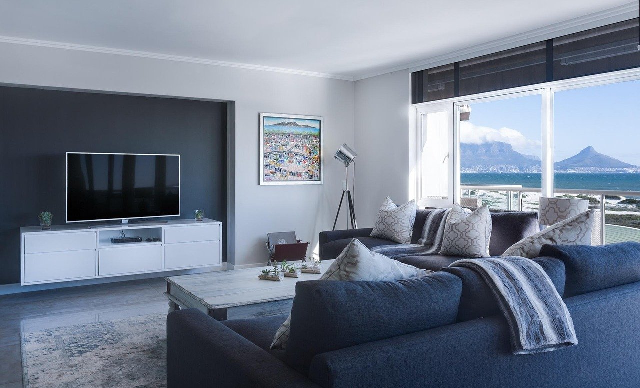
Light walls reflect more light back into the room, which raises overall brightness and makes boundaries between walls and ceiling less obvious. That’s the mechanism. It’s a real optical effect, not a myth.
What’s less reliable is the popular claim that light walls make a room look a specific percentage bigger. That figure gets repeated constantly online without a source, and it’s worth treating with suspicion. The effect is real and noticeable; the precise number usually isn’t.
A few practical notes from people who’ve done it:
- Pick one wall color and repeat it across connected spaces. A single continuous tone reduces visual stops and makes two small rooms read as one larger volume.
- Match trim and ceiling to the walls where you can. Bright white trim against a colored wall draws a hard outline around every edge, which emphasizes how small the room is.
- Avoid stark cool whites in north-facing rooms. They can read gray and dingy. A warm off-white holds up better in low light.
- Test paint on the actual wall, not a swatch card. Small rooms have less ambient light, so colors shift more than they do in a bright showroom.
The common mistake here is choosing a light color but then filling the room with dark furniture. The walls bounce light; the sofa swallows it. Balance matters more than any single choice.
Let negative space do some of the work
Minimalist design treats empty area as a material in its own right. A bare stretch of wall above a low sofa isn’t wasted space. It’s what gives the sofa room to feel intentional rather than crammed.
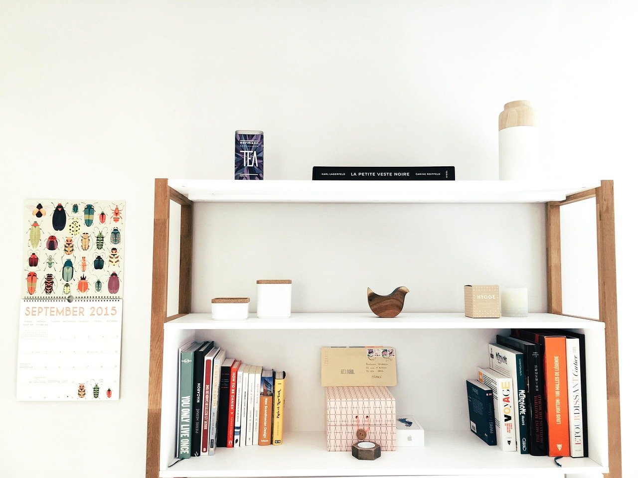
In practice, this means resisting the urge to fill every surface. A shelf doesn’t need to be full. A wall doesn’t need art on every section. Leaving deliberate gaps lets the eye rest, and resting eyes read a room as calmer and larger.
Try this test: stand in the doorway and look at each wall. If your eye can’t find a quiet spot to land, remove something. Repeat until each wall has at least one clear area of empty space.
Choose fewer, larger pieces over many small ones
A cluster of six small framed prints creates six visual interruptions. One large print creates one. The wall area is identical, but the perception isn’t.
The same logic applies to furniture. Two small side tables flanking a sofa add clutter; one well-proportioned table reads as deliberate. A single large rug that runs under the front legs of the seating group unifies the arrangement, while a small rug floating in the middle makes the floor look chopped up.
| Approach | Visual effect in a small room |
|---|---|
| Many small objects | Fragmented, busy, feels tighter |
| Fewer larger objects | Cohesive, calm, feels more spacious |
| Small rug floating in center | Breaks up floor, shrinks the zone |
| Large rug under furniture | Unifies seating, extends the zone |
| Mixed furniture heights and styles | Visual noise, harder to read the room |
| Consistent low-profile furniture | Clear sightlines, more open feel |
The rule of thumb: when in doubt, go bigger with fewer items. It feels counterintuitive in a small space, but it works.
Use vertical space and built-in storage
Floor area is precious. Wall height usually isn’t being used at all. Tall, narrow shelving, ceiling-height wardrobes, and wall-mounted cabinets move storage upward and free the floor for living.
Built-ins are the gold standard because they disappear into the architecture. A recessed alcove turned into shelving, a window seat with drawers underneath, a bench built into a hallway: these read as part of the room rather than as furniture added to it. If a renovation is on the table, this is where the money goes furthest. Homeowners planning structural work often pair storage upgrades with a larger project, and it’s worth comparing home addition contractors design and build services before committing to a layout.
For renters who can’t build in, the equivalent moves are freestanding but tall: a single bookcase that reaches near the ceiling, over-door hooks, and furniture with hidden compartments. The goal is the same, which is to stop using floor space for things you only touch occasionally.
One caveat: open shelving looks minimal in photos and chaotic in real life. If you’re not disciplined about styling, closed storage will serve you better.
Pick multifunctional furniture that earns its footprint
A storage ottoman, a fold-down desk, a sofa bed, a bed with drawers underneath: these pieces do two jobs in the space of one. In a studio apartment, that’s not a gimmick. It’s the difference between a room that works and one that doesn’t.
The mistake people make is buying multifunctional furniture that’s bad at both jobs. A sofa bed with a thin mattress that ruins your back isn’t a bargain. A folding desk that wobbles every time you type isn’t saving you anything. Buy the piece that does its primary job well and its secondary job adequately.
Also be honest about how often you’ll actually convert things. A murphy bed that requires clearing the floor and moving a rug every night will stop being used within a month. Favor conversions that take under 30 seconds.
Reduce visual clutter in addition to physical clutter
Two rooms can hold the same number of objects and feel completely different. The difference is usually visual noise: mismatched packaging, tangled cords, busy patterns, and dozens of small items left out.
Practical fixes that cost almost nothing:
- Decant or hide packaging. Matching containers in a cupboard or on a shelf remove the visual static of labels and logos.
- Deal with cables. A single cable run along a skirting board is almost invisible; a tangle behind a desk is not.
- Limit patterns. One patterned element per room is usually enough. Two competing patterns fight each other and make the space feel smaller.
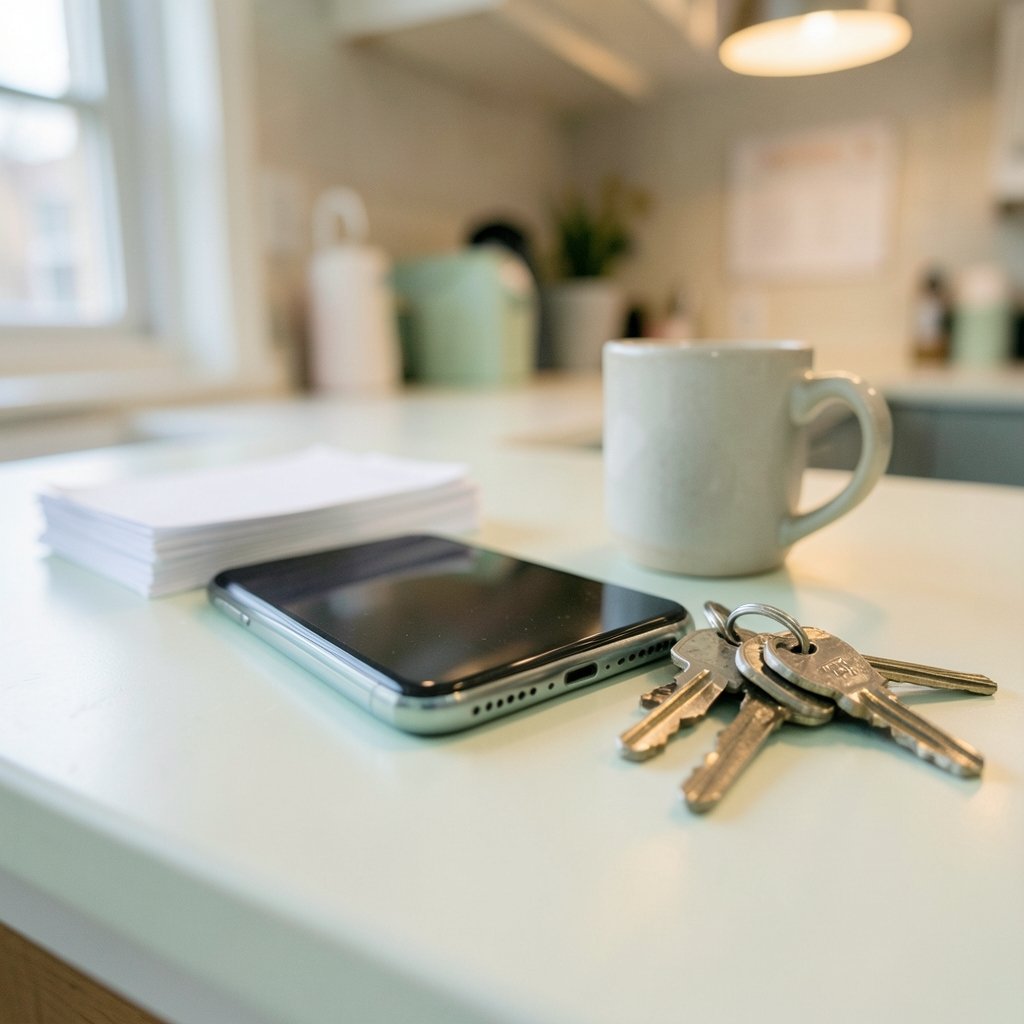
- Create a landing spot by the door for keys, post, and bags, so clutter doesn’t migrate to the kitchen counter.
- Do a five-minute reset daily. Small spaces go from calm to chaotic fast, and a quick tidy at the end of the day prevents the buildup that makes rooms feel tight.
If you’re planning a broader refresh alongside the decluttering, browsing home remodeling ideas for stylish room updates can help you prioritize which changes deliver the most visual relief per dollar.
Use mirrors and reflective surfaces with intention
Mirrors bounce light and add perceived depth, and they’re one of the cheapest interventions available. But placement matters more than quantity.
The strongest position is usually opposite or adjacent to a window, where the mirror catches daylight and throws it back into the room. A mirror on a dark wall facing nothing reflective does very little. A wall of mirrors, meanwhile, can tip from “spacious” into “dance studio,” so one well-placed large mirror usually beats several small ones.
Glossy finishes, glass tabletops, and polished floors offer subtler versions of the same effect. Use them sparingly. Too many reflective surfaces in a small room create glare and visual confusion rather than openness.
Keep the floor and sightlines continuous
A room with four different flooring materials reads as four small rooms. Continuous flooring from one zone to the next, ideally in a light or mid tone, makes the space read as a single volume.
The same principle applies to sightlines. Low furniture keeps the view across the room clear. A sofa with a high back placed in the middle of a small living room acts like a wall. If you need to divide a studio into zones, do it with rugs, lighting, or a change in ceiling height rather than with tall furniture.
If you’re working out where things should go before you buy anything, an AI interior design generator for room ideas can help you test layouts without moving a single piece of furniture.
Match your lighting to the room’s scale
One overhead bulb in the center of a small room flattens everything and casts harsh shadows. Layered lighting, with a mix of ambient, task, and accent sources, makes a room feel considered and, crucially, bigger after dark.
Aim for at least three light sources in a living room: a ceiling fixture or floor lamp for general light, a task light near seating, and something low and warm for atmosphere. Dimmers are worth the small extra cost, because a small room at full brightness at 10pm feels clinical.
Wall lights and picture lights are underused in small homes. They free up floor and table space, which is exactly what a tight room needs.
Know the mistakes that quietly shrink a room
Some of the most common small-space choices work against the goal:
- Pushing every piece of furniture against the walls. It seems space-saving, but it leaves an awkward empty center and makes the room feel like a corridor. Floating the seating group slightly off the wall often reads better.
- Buying furniture that’s slightly too big for the room. Oversized sofas in small living rooms are a classic error. Measure the room, tape the footprint on the floor, then shop.
- Over-decorating to compensate. A small room filled with “small-space hacks” becomes cluttered. Restraint is the hack.
- Ignoring the entryway. The first thing you see when you walk in sets your impression of the whole home. A clear, calm entry does more than any single living room purchase.
- Skipping the declutter. No paint color or mirror fixes a room holding twice what it should. Sort first, decorate second.
Conclusion
Minimalism in a small home comes down to a handful of consistent habits: fewer and larger objects, light and continuous surfaces, storage that climbs the walls instead of spreading across the floor, and a genuine willingness to leave space empty. None of it requires a big budget. Most of it requires editing.
The homeowners who get this right tend to describe the same outcome. The rooms don’t just look bigger. They feel easier to live in, because there’s less to manage, less to move, and less to notice. In a small home, that quiet is the whole point.
Frequently asked questions
Does minimalism actually make a small room look bigger?
Yes, though mostly through reduced visual clutter rather than any single trick. Fewer objects, continuous surfaces, and light colors reduce the number of visual interruptions the eye has to process, and rooms with fewer interruptions read as more open. The effect is real and noticeable, even if the specific percentages quoted online are usually unsourced.
What’s the biggest mistake people make in small minimalist rooms?
Buying furniture that’s slightly too large for the space. It’s the most common error and the hardest to undo. Measure the room, mark the footprint on the floor with tape, and live with the outline for a day before buying anything.
Should I use white walls in a small home?
Often, yes, because light colors reflect more light back into the room. But stark cool white can look gray and flat in north-facing rooms with limited daylight. A warm off-white or soft neutral usually holds up better. What matters more than the exact shade is keeping trim and ceiling close in tone so the room doesn’t get outlined in hard edges.
How do I add storage without making the room feel crowded?
Go vertical and go closed. Tall, narrow units and ceiling-height wardrobes use wall height rather than floor area, and closed doors hide the visual noise that open shelving creates. Built-ins that disappear into the architecture work best of all if the budget allows.
Are mirrors worth it in a small room?
Yes, when placed well. A large mirror positioned opposite or beside a window bounces daylight back into the room and adds perceived depth. Several small mirrors scattered around usually create visual clutter instead. One good mirror beats five mediocre ones.
How do I keep a small minimalist home from feeling cold or empty?
Add texture and warmth rather than more objects. A wool throw, a linen curtain, a wooden surface, a plant, and warm-toned lighting all soften a minimal room without adding clutter. The goal is calm, not sterile, and texture is what separates the two.