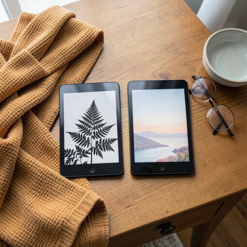
What if the biggest decision in your next e-reader purchase comes down to a layer of plastic thinner than a human hair? That is essentially the choice between E Ink Carta and E Ink Kaleido. One is a pure black-and-white panel tuned for crisp text. The other stacks a color filter array on top of a similar grayscale base to give you 4,096 colors. They look similar in a product photo and behave very differently in your hands.
This comparison breaks down how each panel works, where each one wins, and which devices actually use them, so you can pick with your eyes open instead of guessing from a spec sheet.
Carta vs Kaleido at a Glance
| Criterion | E Ink Carta | E Ink Kaleido |
|---|---|---|
| Color support | None (16 grayscale levels) | 4,096 colors |
| Resolution | Full panel resolution, up to 300 PPI | 300 PPI black-and-white, 150 PPI color |
| Contrast | Best available in e-paper | Lower, because the color filter sits over the ink layer |
| Best for | Long-form books, documents, writing | Comics, magazines, illustrated books, color notes |
| Refresh speed | Fastest generation-to-generation gains | Inherits the base panel’s speed; animation mode reaches 8–9 fps |
| Typical devices | Kindle Paperwhite, most Kobo and BOOX monochrome models | BOOX Go Color 7, Kobo Libra Colour, PocketBook color models |
The table tells most of the story in ten seconds. The rest of this article explains why those numbers matter in daily use.
How Each Panel Actually Works
Carta is E Ink’s monochrome generation line. The company has iterated through Carta 1000, 1200, and 1300, with each step improving contrast and page-turn speed. Carta 1200, released around 2021, delivered roughly 20% better contrast and 25% faster refresh than the prior generation. Carta 1300, which arrived around 2024, pushed contrast up about 30% over Carta 1200 and refresh about 33% faster. A newer Carta 1400 has reportedly slipped toward 2027, so today’s shoppers are mostly choosing among 1200-class and 1300-class panels.
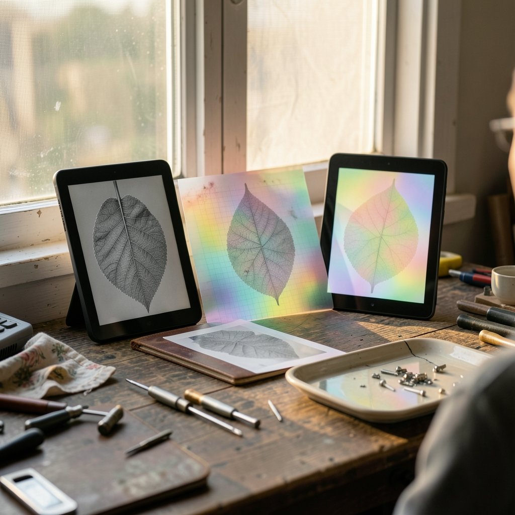
Kaleido takes a different approach. It builds on a standard black-and-white E Ink layer and adds an RGB color filter array on top. Think of it as a sheet of colored plastic laid over a black-and-white photo: simple, effective, and with a visible cost. Because each pixel is split into red, green, and blue subpixels, color resolution is exactly half the monochrome resolution. On Kaleido 3, that means 300 PPI for text and 150 PPI for color content.
That halving is the single most important fact in this comparison. At 150 PPI, color images show a faint grid pattern. It is tolerable for comics and magazines and noticeable on detailed illustrations or maps.
Older color approaches used a separate glass color panel, which hurt reflectivity and forced aggressive front lighting. Kaleido’s contribution was removing that extra glass layer, which made color e-readers lighter and less dependent on the light guide.
Sharpness and Contrast: The Carta Advantage
For pure reading, Carta still sets the standard. Black text on a Carta panel looks like ink on paper, and the background reads as a light gray rather than a washed-out white. Readers who compare the two side by side almost always notice the difference immediately.
A telling data point comes from a reader forum discussion where a long-time user chose a seven-year-old Carta-based Inkpad 3 over a newer Kaleido 3 device for plain books. The reasons given were comfort, weight, and above all contrast. That is the honest trade-off: a color layer costs you some background brightness and text punch.
If your reading is 90% novels, biographies, and PDF reports, Carta wins without much debate. The panel is doing exactly one job and doing it at full resolution.
Color That Earns Its Place
Kaleido is not a gimmick, though. It changes what an e-reader can do.
Comics and graphic novels look genuinely readable on Kaleido 3, and the 150 PPI color grid fades at normal viewing distance. Magazine layouts, cookbooks, children’s books, and textbooks with color-coded diagrams become practical. Highlighting in multiple colors, color-coded notes, and annotated PDFs with colored markup all work.
The catch is that color e-paper remains a compromise technology. Color saturation is limited, and the palette is modest compared with any LCD or OLED screen. If you expect tablet-like color, Kaleido will disappoint you. If you want a paper-like screen that can occasionally show color without glowing at your face, it delivers.
Refresh Speed and Writing Feel
Refresh speed is where the generations blur together. E Ink does not publish exact millisecond figures for Carta or Kaleido, only percentage improvements and an animation frame rate. Kaleido 3 inherits the speed of the underlying Carta 1200 or 1250 panel, and its animation mode reaches roughly 8–9 frames per second.
In practice, both panel types feel snappy for page turns. For handwriting, the bottleneck is usually the tablet’s digitizer and software rather than the panel itself, though a slower panel makes latency worse. Anyone who plans to write should read up on why e ink tablet writing latency slows your stylus down before blaming the screen.
Which Devices Use Which Panel
The device landscape splits fairly cleanly.
Monochrome Carta readers include the Kindle Paperwhite line, most standard Kobo models, and BOOX’s black-and-white tablets. These are the workhorses of long-form reading.
Kaleido devices include the BOOX Go Color 7, the Kobo Libra Colour, and PocketBook’s color models. BOOX has used Carta and Carta Plus panels across its monochrome range for years, and its color line sits on Kaleido.
A third name worth knowing is Gallery, E Ink’s full-color alternative to Kaleido. Gallery uses a different architecture that can hit 300 PPI even in color, with a wider palette. It is also rare and expensive. Gallery 3 and the next Kaleido generation are both reportedly waiting on the delayed Carta 1400 base panel, so neither is arriving soon. Spectra is a signage-focused color technology, not a reading panel, and it does not belong in an e-reader shortlist.
Matching the Panel to Your Reading Life
Here is the practical decision framework.
Choose Carta if you read mostly text, care about the blackest text and lightest background, want the lightest possible device, or plan to write and annotate heavily in monochrome. You will also usually pay less for the same screen size.
Choose Kaleido if comics, magazines, illustrated nonfiction, or color-coded notes are a real part of your week. Accept the softer contrast and the 150 PPI color resolution as the price of admission, and treat color as a bonus rather than the main event.
A useful test: count how many of your last ten books had pictures that mattered. Zero or one, and Carta is the honest answer. Three or more, and Kaleido starts to justify itself.
Practical Tips and Common Mistakes
A few things trip people up after they buy.
First, do not judge a Kaleido screen by a store demo under harsh overhead lighting. Front light settings change perceived contrast dramatically. Adjust the warmth and brightness before deciding.
Second, remember that color PPI is half of monochrome PPI. A “300 PPI” color reader is a 150 PPI color device. Read the fine print on the spec sheet.
Third, do not chase the newest Carta generation if you already own a Carta 1200 device. The jump to Carta 1300 is incremental, not transformative. The bigger leap was from Carta 1000 to 1200.
Fourth, protect the surface. A matte screen protector changes glare and feel, and the wrong one can dull an already softer Kaleido background. The texture debate is worth understanding before you buy, and this guide to e ink tablet screen protector texture paper feel matte or covers the trade-offs.
Finally, if you write by hand, budget for nib wear. A worn nib makes any panel feel scratchy and imprecise, and swapping at the right moment matters more than most buyers expect. The rules for e ink tablet nib replacement when swap do it right are simple but easy to ignore.
The Verdict by Use Case
For novel reading, Carta wins. For comics and magazines, Kaleido wins. For students annotating color-coded textbooks, Kaleido wins with reservations about contrast. For note-takers and journalers, Carta is usually the better companion, and the case for e ink tablets handwritten journals actually works daily use rests on exactly that crisp monochrome surface. For anyone torn between panel families on a specific model, this breakdown of e ink carta vs kaleido which display should your next reader goes deeper on device-level differences.
There is no universal winner. There is only the panel that matches what you actually read.
Conclusion
Carta and Kaleido are not rivals so much as siblings with different jobs. Carta is the specialist: maximum contrast, full resolution, no compromises for text. Kaleido is the generalist: slightly softer, half-resolution in color, but capable of showing you things Carta simply cannot. The color filter array that makes comics possible is the same layer that costs you some background brightness, and that trade is the whole decision in miniature. Know your reading mix, check the generation of the panel, and ignore the marketing gloss. Your eyes will thank you for the next several years.
Frequently Asked Questions
Is Kaleido worse than Carta for reading plain text?
For plain text, yes, slightly. Kaleido’s color filter layer reduces background brightness and contrast compared with a pure Carta panel. Text still renders at 300 PPI on Kaleido 3, so sharpness holds up, but the page looks a touch grayer. Most readers notice it in a side-by-side comparison and stop noticing after a few days of normal use.
Why is Kaleido’s color resolution only half its black-and-white resolution?
Because the color filter array splits every pixel into red, green, and blue subpixels. Each subpixel handles one color, so the color image effectively uses half the pixel density of the monochrome layer beneath. On Kaleido 3 that works out to 300 PPI for text and 150 PPI for color.
Should I wait for Carta 1400 or the next Kaleido generation?
Probably not, unless you are patient. Reports put Carta 1400 production in the second half of 2027, and the next Kaleido and Gallery panels reportedly depend on that base panel arriving first. Buying a current Carta 1300 or Kaleido 3 device now means years of useful life before the next wave lands.
Does a color screen drain the battery faster?
Color e-paper still only draws power when the image changes, so idle battery life remains excellent. The bigger factors are front light brightness, refresh frequency, and how much animation or video you run. Reading comics page by page is far gentler on the battery than scrolling.
Can I write or draw on a Kaleido screen?
Yes. Kaleido devices with stylus support handle handwriting and sketching fine, and color ink options are a genuine advantage for note-taking. Expect the same latency profile as the underlying panel, which is generally good but not instant.
Is Gallery better than Kaleido?
Gallery offers full color at up to 300 PPI and a wider palette, which sounds like a clear win. In practice it is rare, expensive, and slow to refresh, and its next generation is tied to the same delayed base panel. For most buyers, Kaleido 3 remains the practical color choice.
The FAQ answers above cover the questions buyers ask most often, but one theme runs through all of them: generation matters as much as family. A Carta 1200 device from a few years ago still reads beautifully, and a first-generation Kaleido panel looks noticeably duller than Kaleido 3. When you shop, check the exact panel generation in the spec sheet rather than trusting the brand name alone. That single habit will steer you toward the right screen more reliably than any review.